Magazine Group Project
In my Digital Layout 2 class, our final project was to design a magazine in the style of an already existing publication complete with ads. As this was a group project, we were assigned different roles to complete the assignment. I was given the role of Art Designer and really embraced my position. All but 2 images on my pages were taken and edited by me to fit the style of the magazine and the issue topic we came up with.

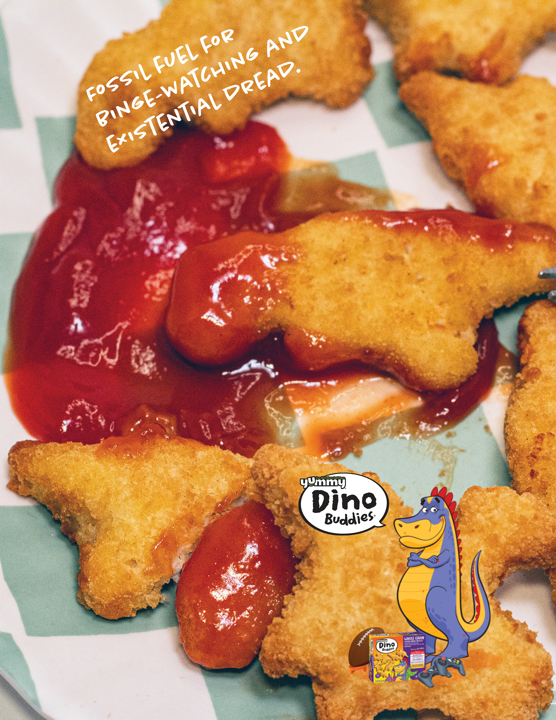
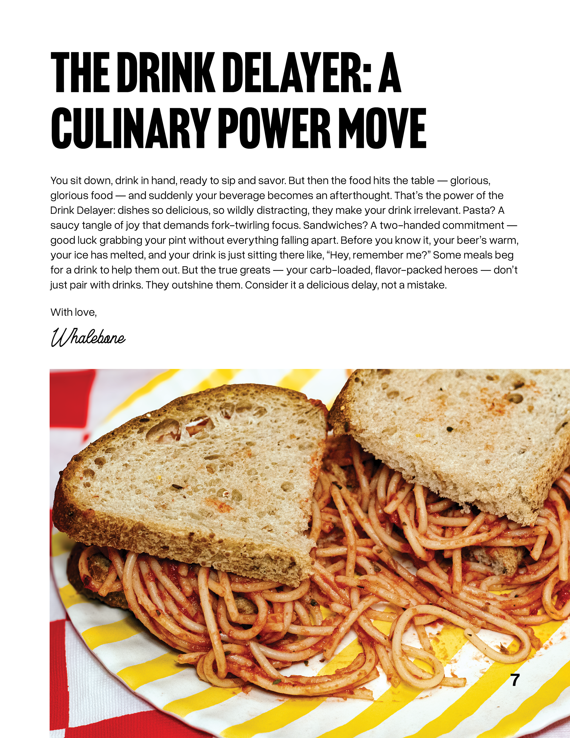
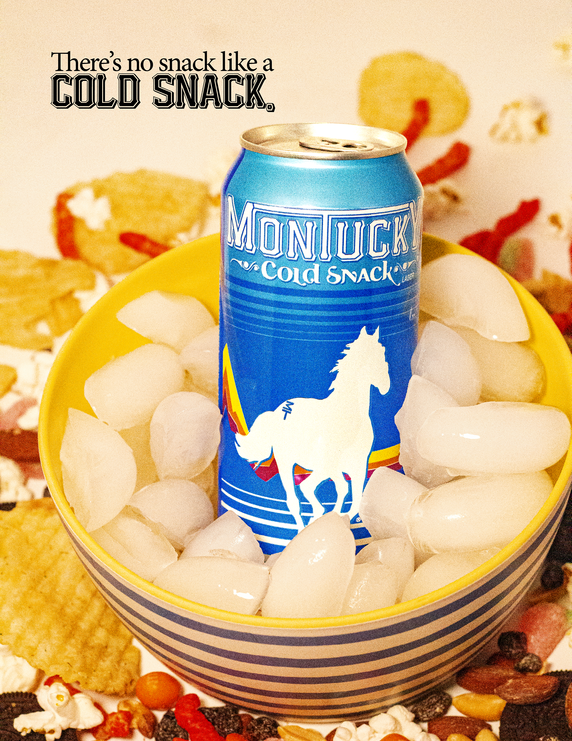
The above images are the issue cover, an interior ad, the introduction to the issue, and the back cover ad. The ads in Whalebone magazine issues tend to relate to the topic of the issue itself, so it was important for me to make sure that an issue about food and beer have ads that also focus on those two elements.
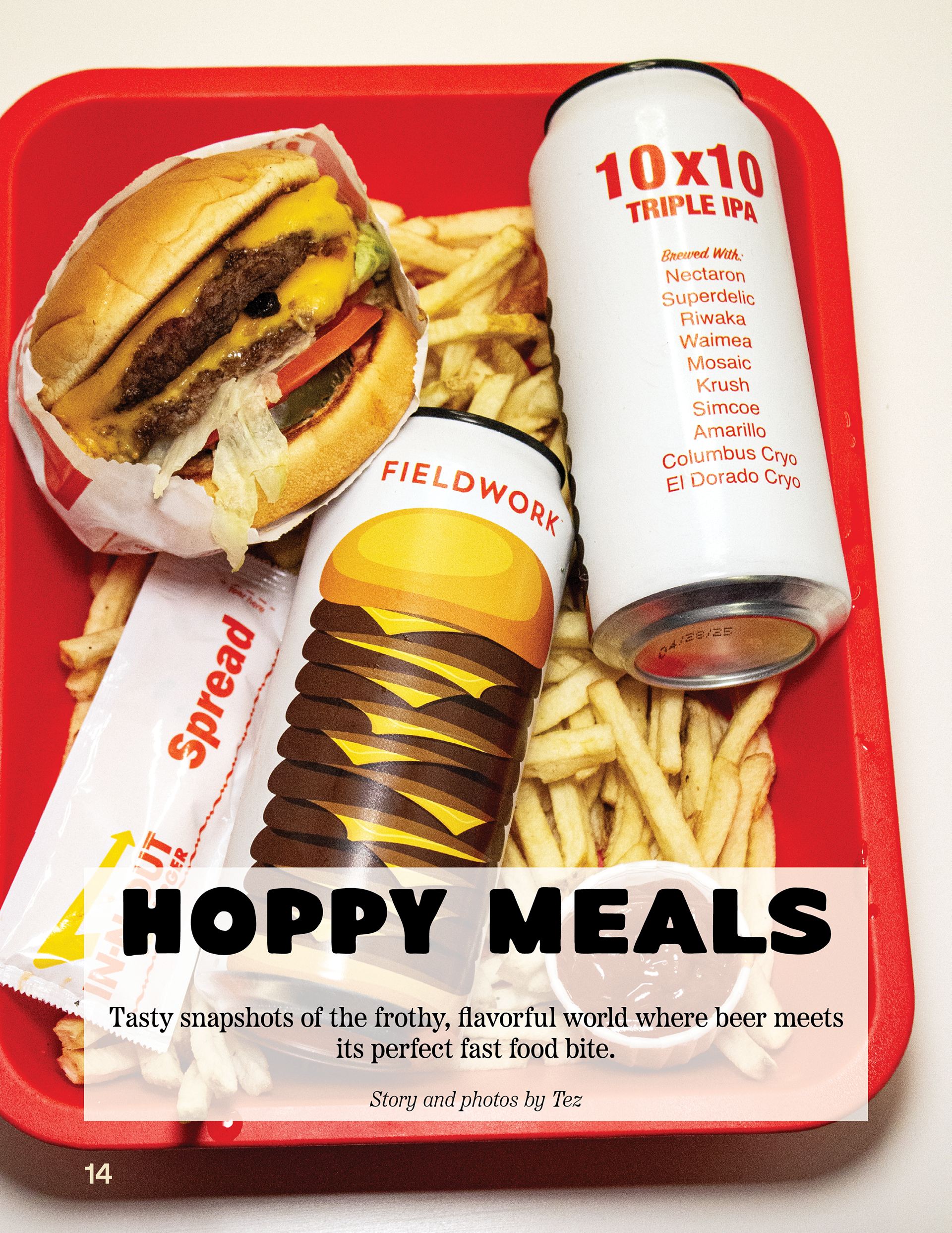

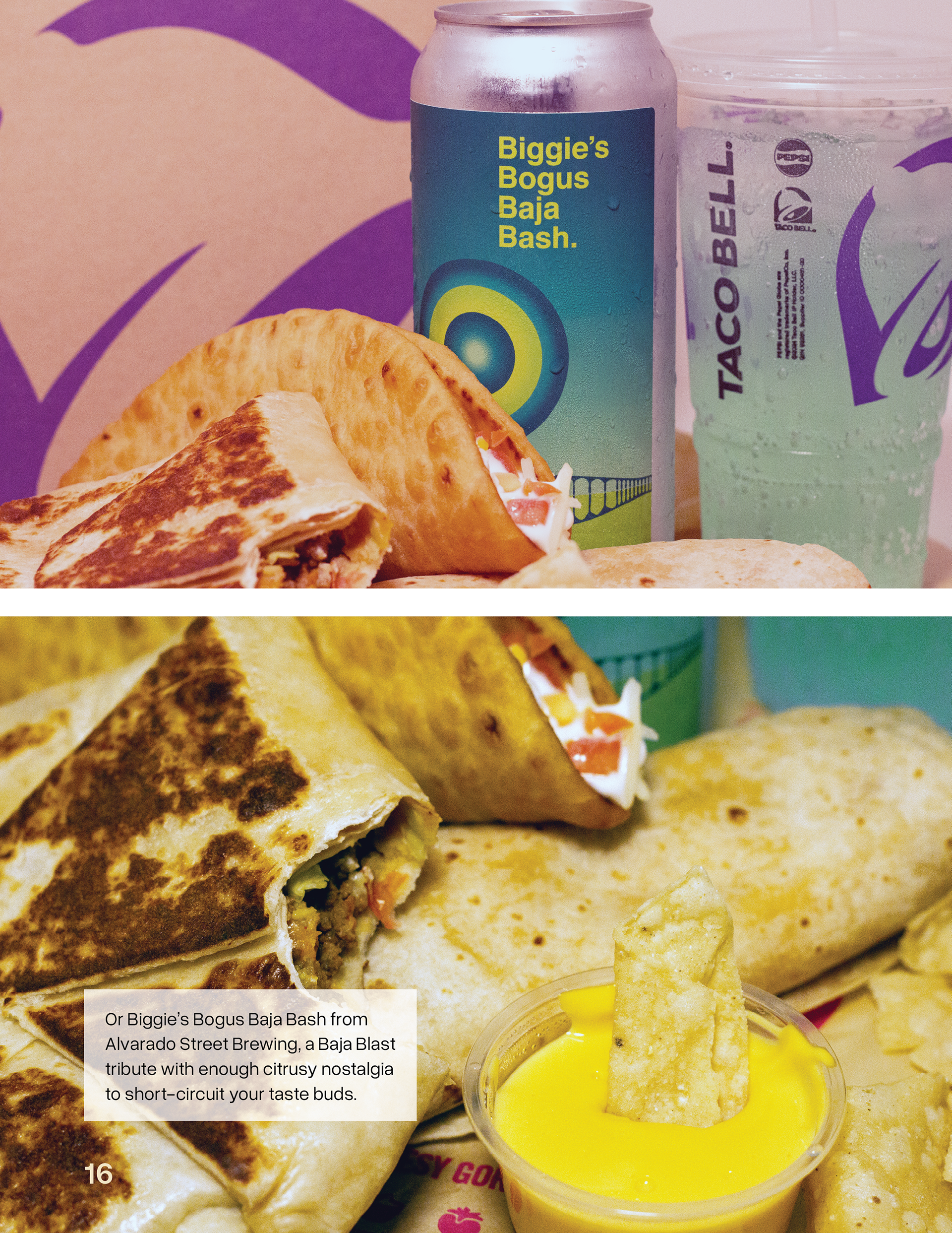

The two spreads above were the most fun and most difficult to put together. As a hobby, I like to take photos of beer that are themed for different food or drink items so this project was really fun for me to do. I took so many photos that turned out really well, it made it hard to choose just a couple for my layout.
The Do Good Poster Project
One of my final projects for my Digital Layout 1 course consisted of designing a poster meant to represent a good cause. We had a couple of options to choose from and I chose Reshma Saujani's Ted Talk presentation on the creation of her company, Girls Who Code. My poster design was featured in the faculty-curated Year End art show at Sacramento City College in 2023.
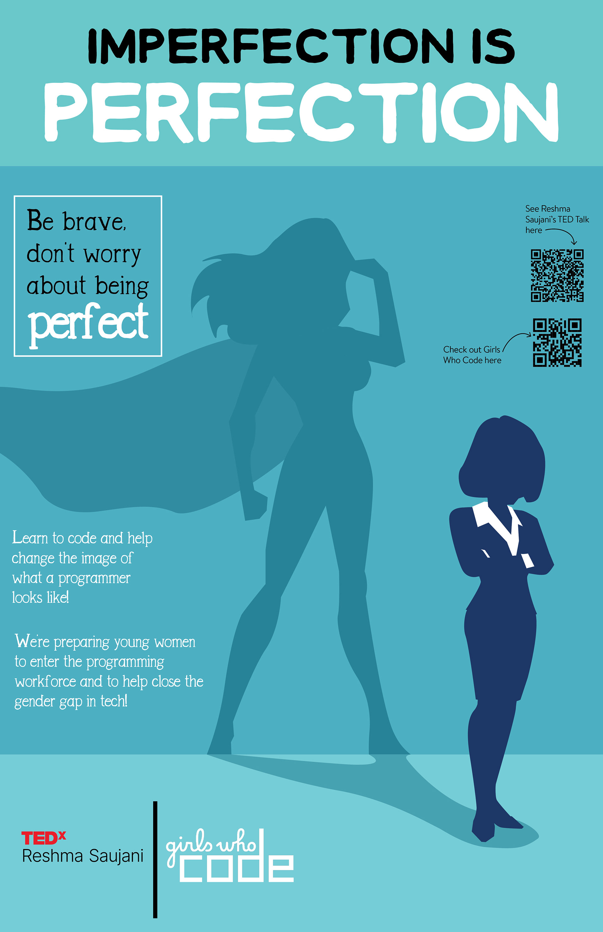
The above poster is a representation of her message that women are raised with the idea of perfection as the ultimate life goal. Saujani's talk reflected on the beauty of failure and how brave it is to reject the idea of perfection.
Campus Brewing Website Beer Campaign
When I was hired as the Social Media Manager at Campus Brewing company, I assigned myself a couple of special projects to help get consistent content on the website that followed the brewery's concept: Beer School.
The original website had some low-resolution images of beer in pint glasses with vague descriptions of the beer itself. The owner wanted each beer to have it's own little webpage with more info that was image forward, so I came up with the concept below.
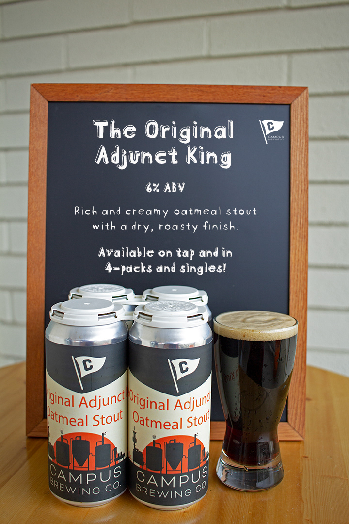
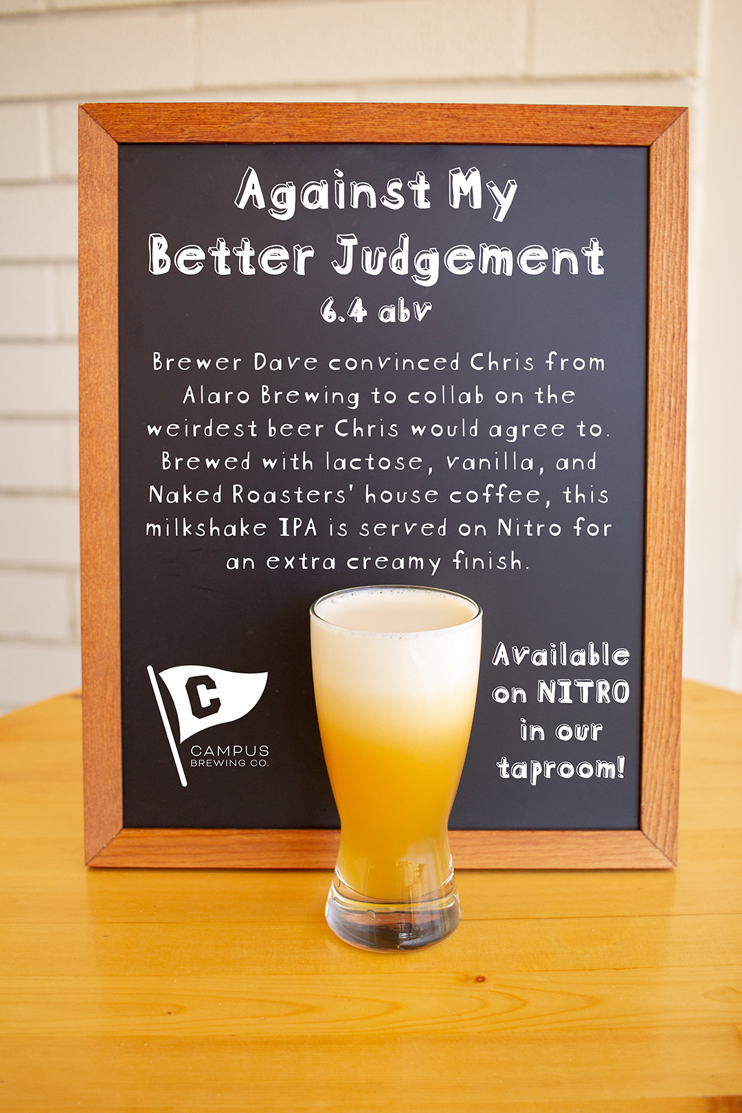
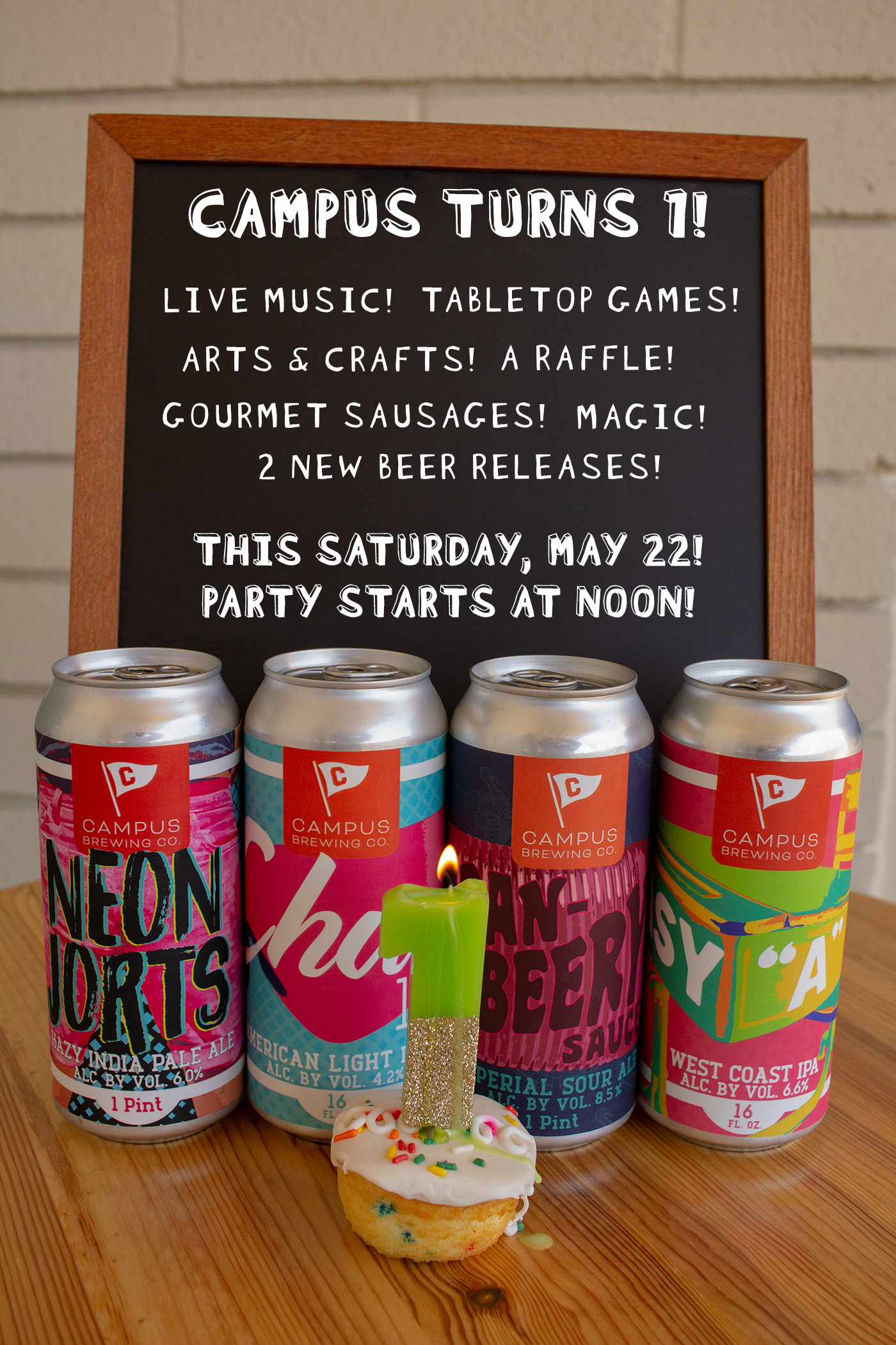
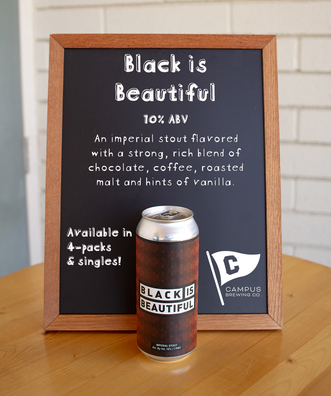
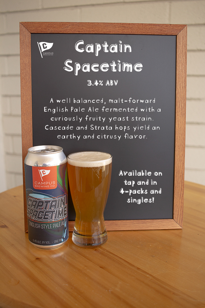
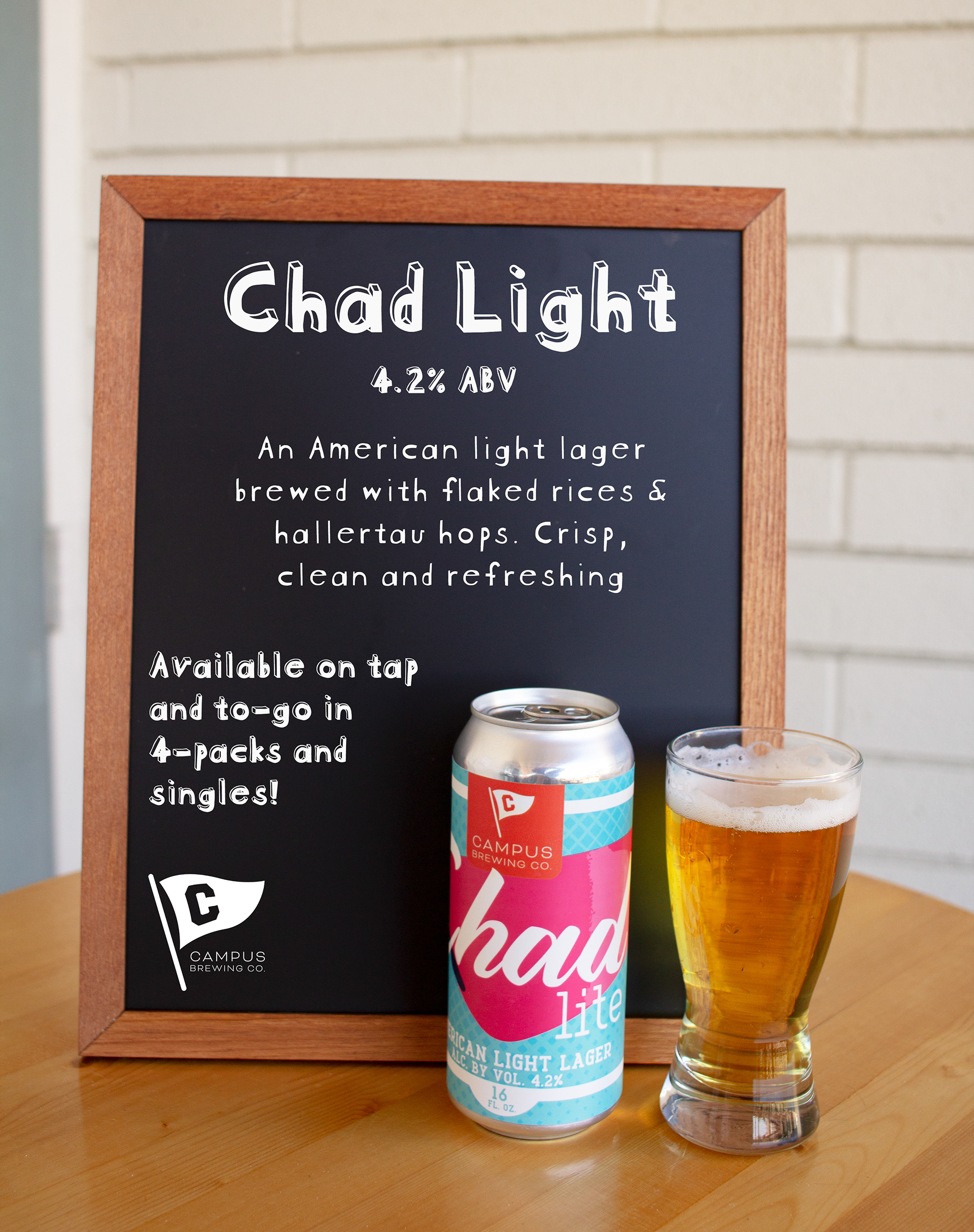
I took photos of the various different beers, uploaded them to InDesign, and used a font that best looked like chalk to include information about those specific beers. I was even able to use this concept for social media ads for consistency.