The videos above and below show the final results of my desktop and mobile versions of the final product. I used Adobe XD to ensure that all of the interactions were fully functional and that every page layout was consistent with the rest of the design. For the mobile version, there are a couple of changes to things like the drop down menu to account for space on the page.
While this project was time consuming, it was also very educational and a great learning experience. To see the steps I took to get to the final result, please see below.
Phase 1: Project pitching
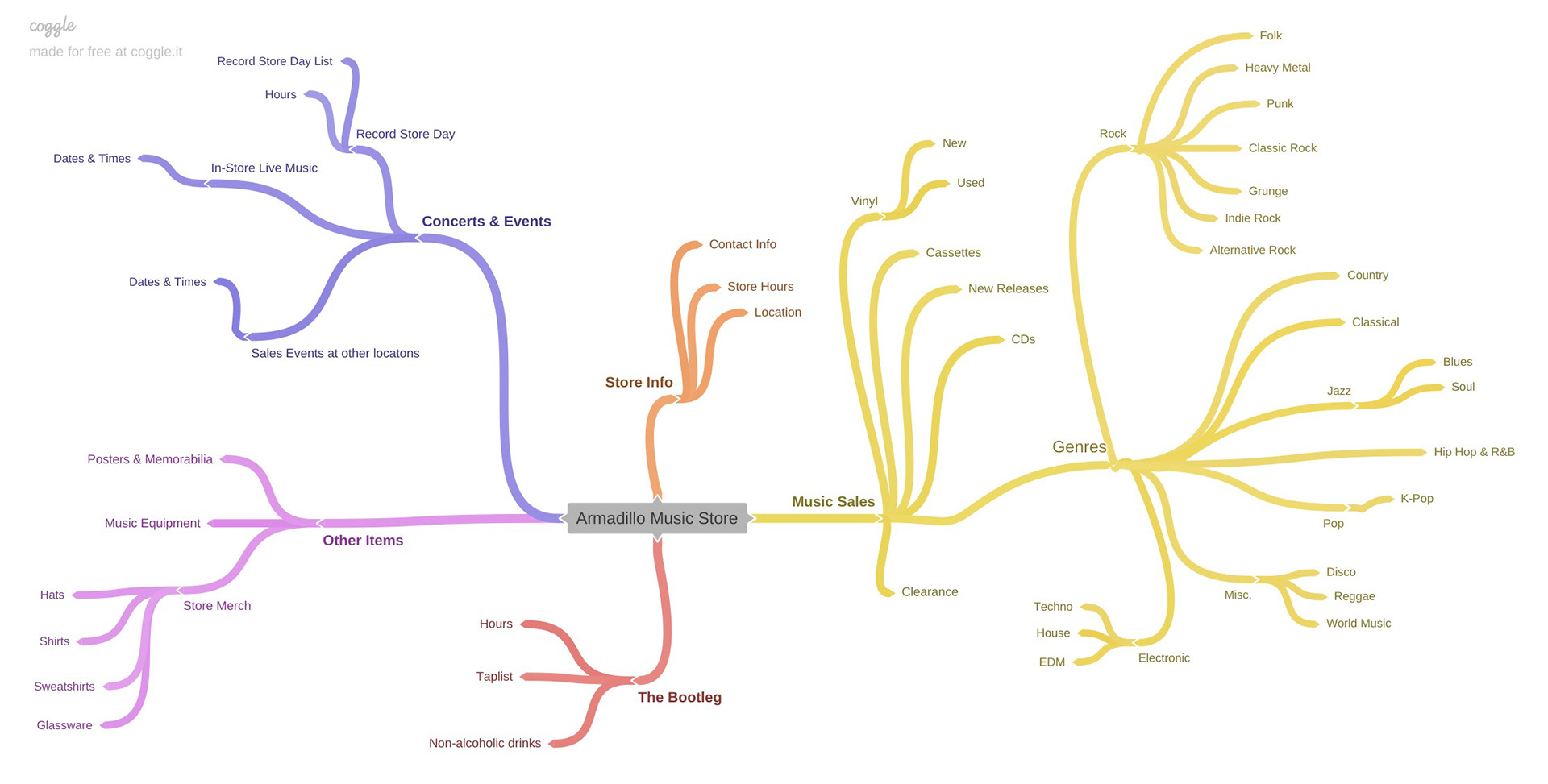
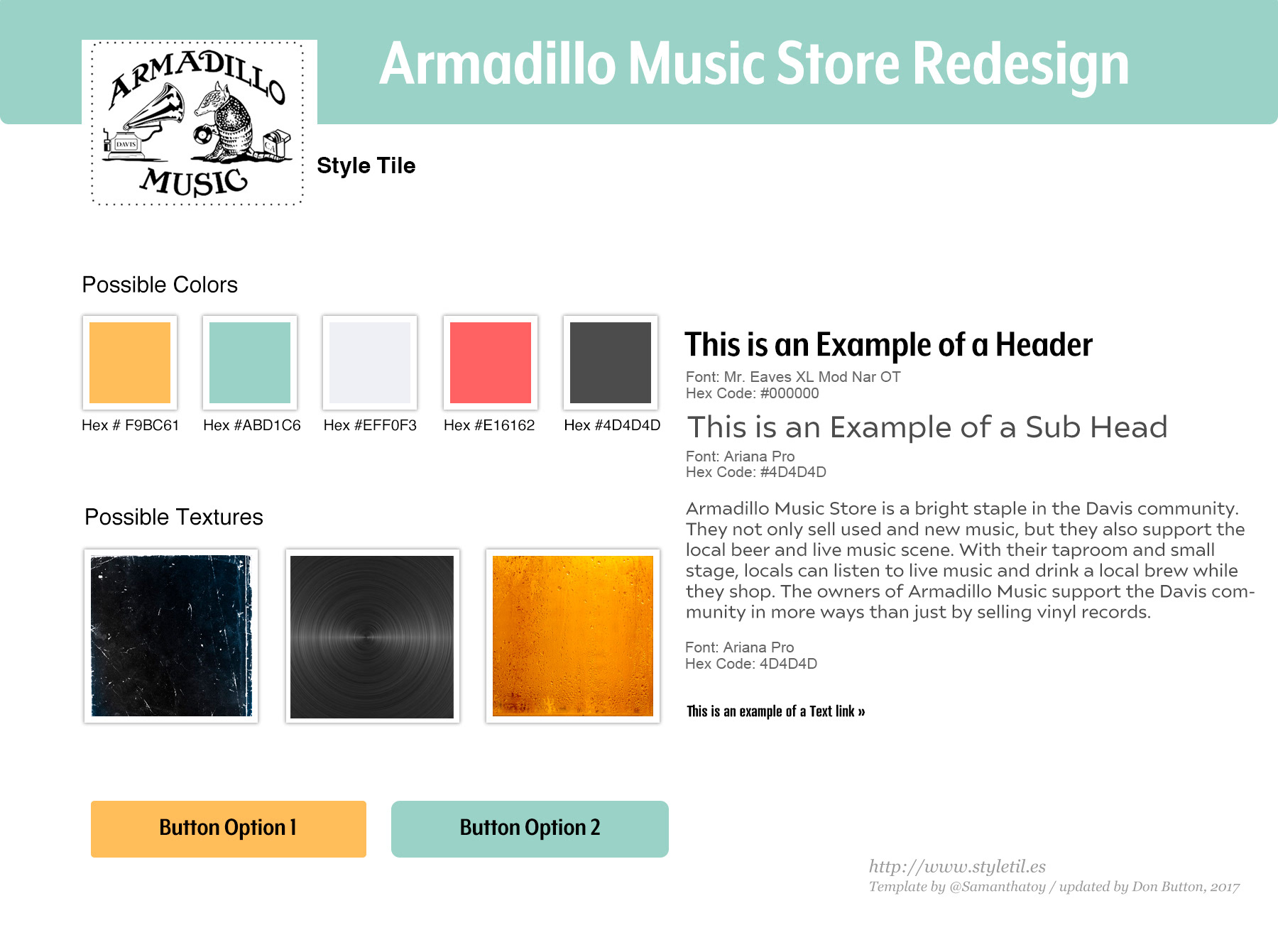
For this phase, I first submitted a creative brief to my professor along with a screenshot of Armadillo's current website. Once this was approved, I took an asset inventory of the site and used coggle.it to build a mind map of that information. The final task for this phase was to use Adobe Indesign to build out a style tile that illustrated my ideas for colors, textures, button designs, and fonts for the website.

Phase 2: User research
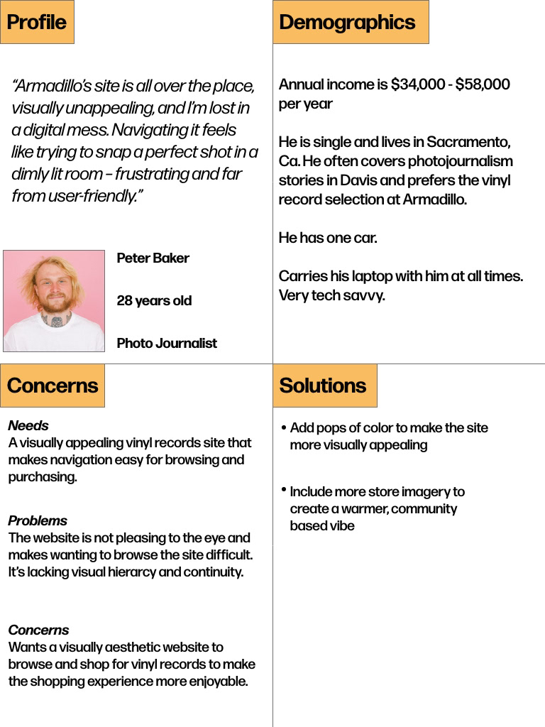
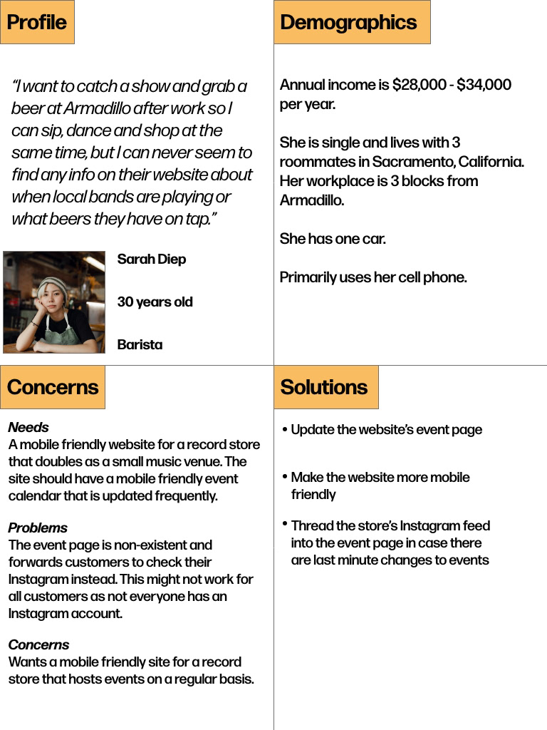
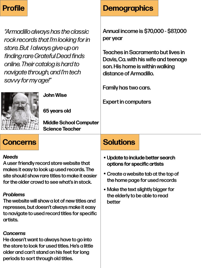
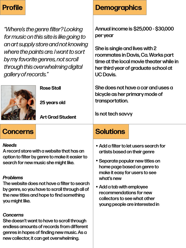
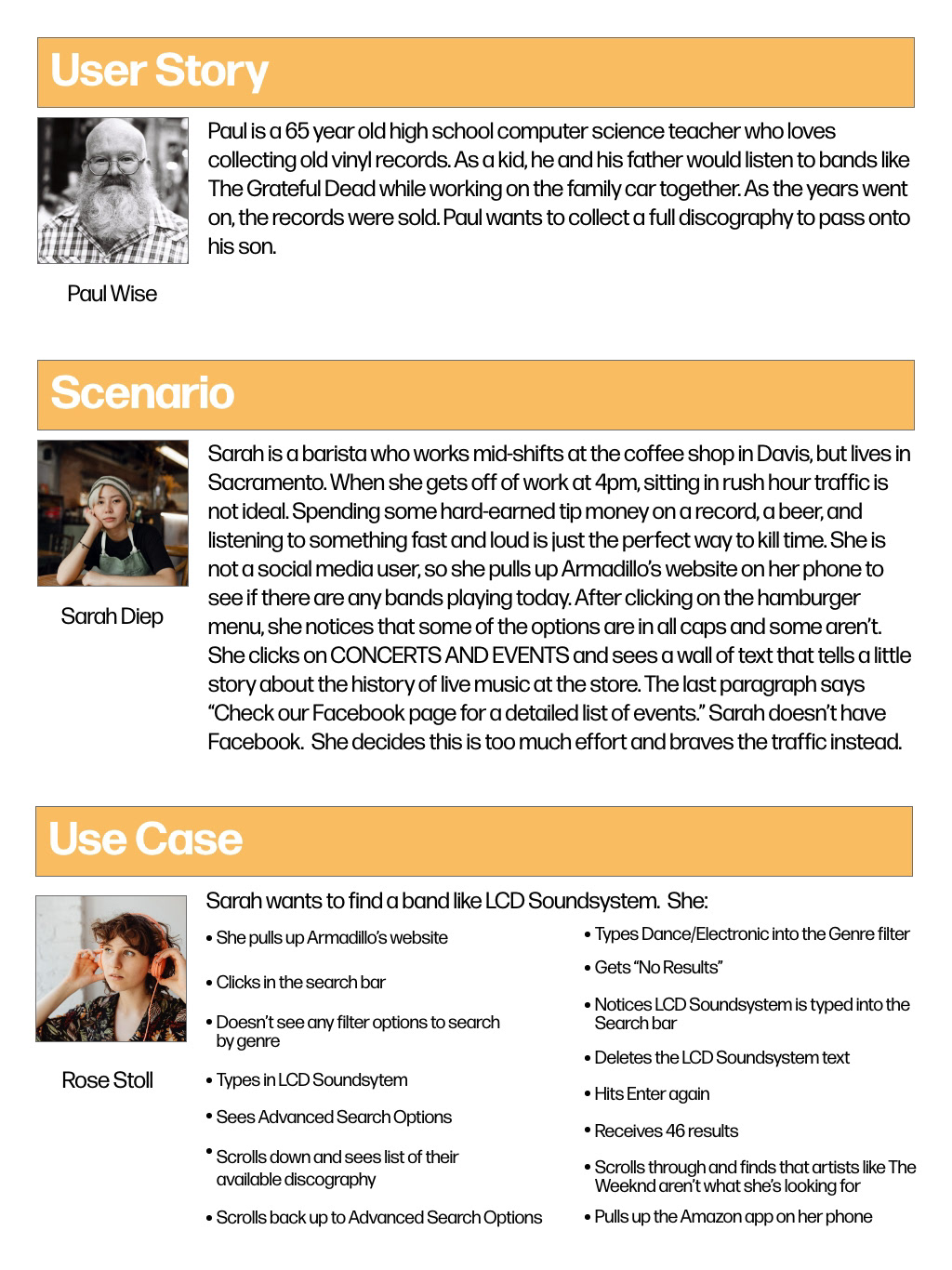
I used adobe indesign to create some user personas, a user story, scenario and use case. While the people and stories used in these examples are fictional, I understand that a big part of the UX/UI process is conducting user research in order to find the best solution for the client.
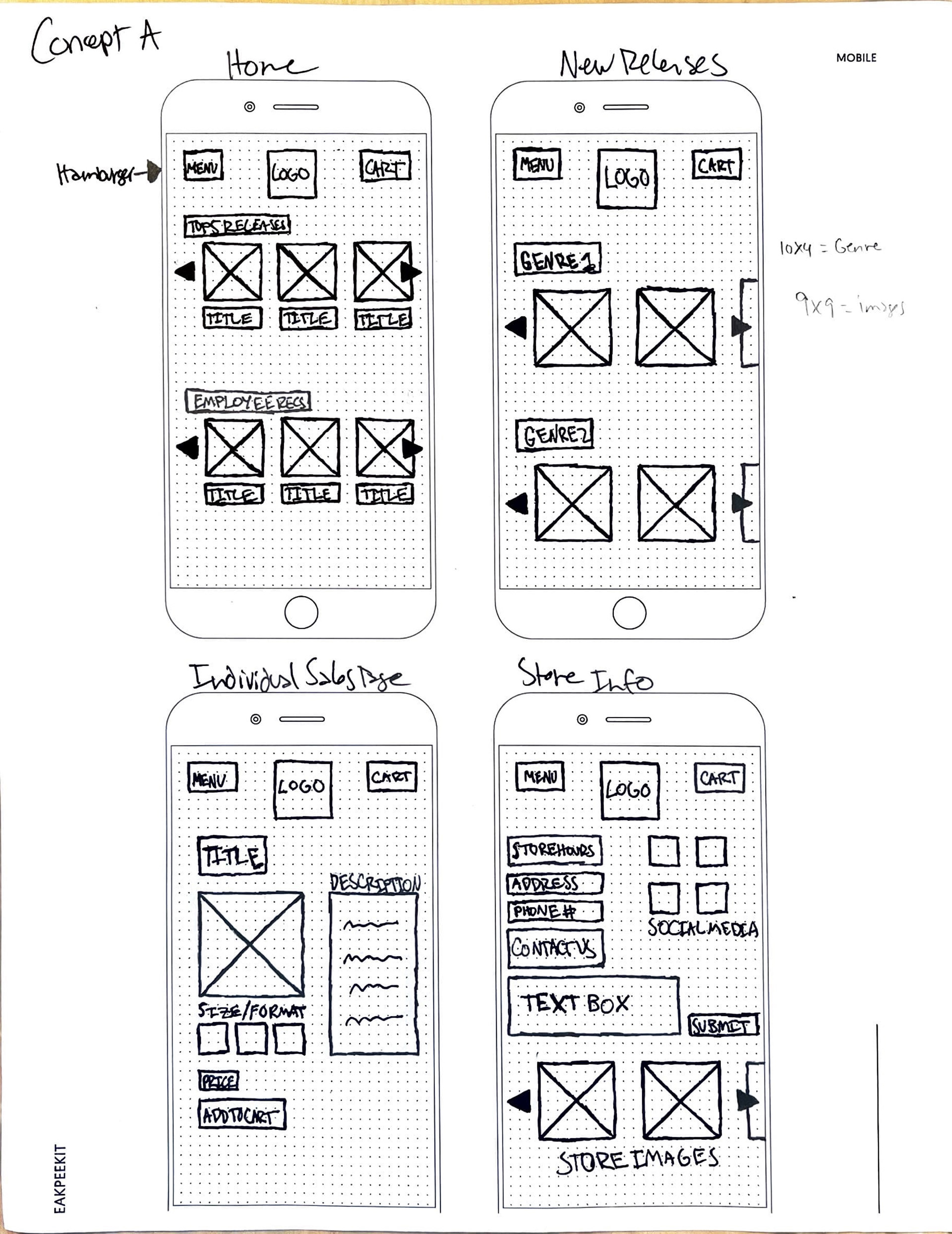
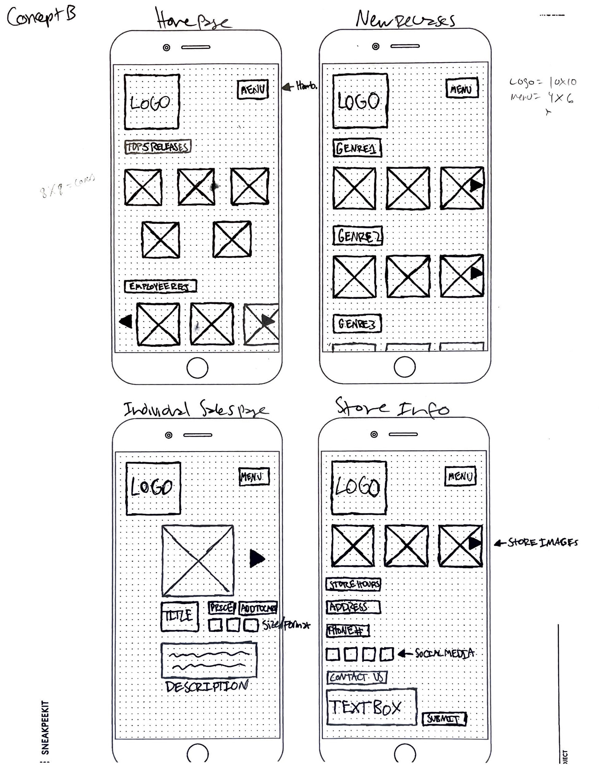
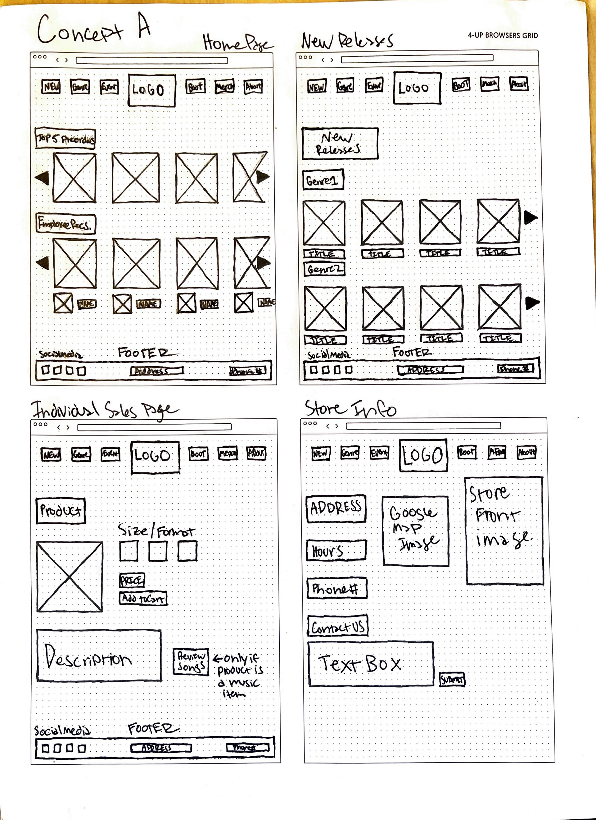
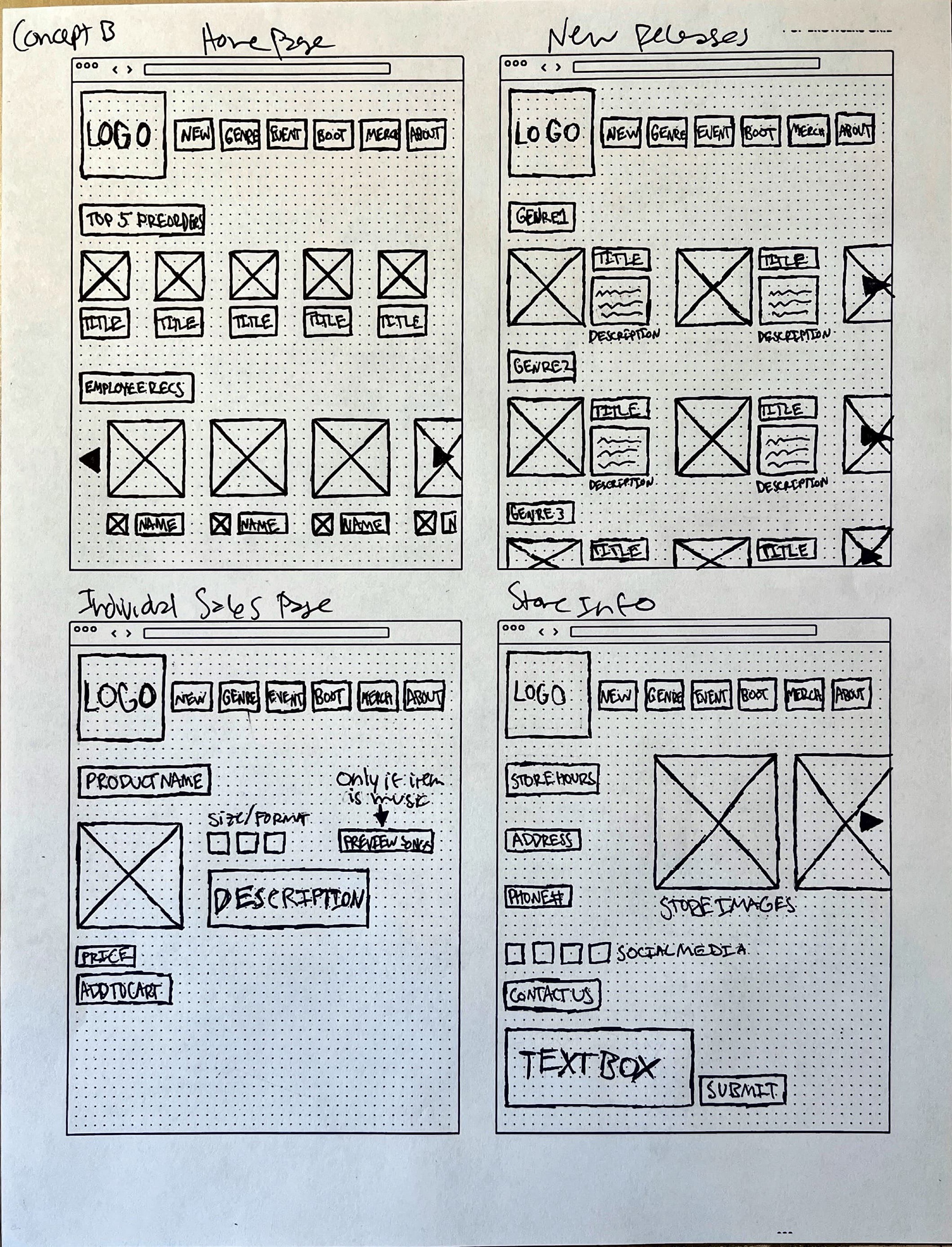
Phase 3: Hand-drawn wireframes
The sketching phase was very helpful for figuring out how I wanted to design the actual interface. Our assignment was to sketch two design concepts for 4 mobile pages and two for 4 desktop pages. My final design ended up featuring elements from both concept A and concept b pages. While I am not the best at sketching, I found this phase to be extremely beneficial to the ui process and often went back to these sketches while working on my final design.
Phase 4: Digital Wireframes
Desktop Wireframes
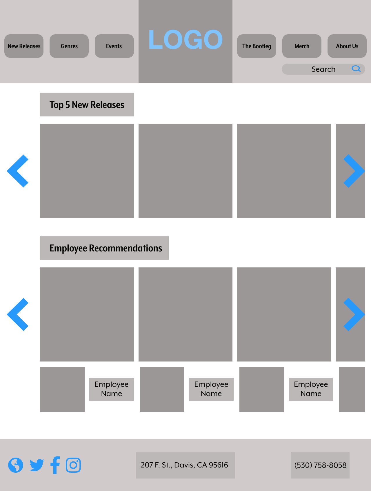
Using Adobe Xd, I took my ideas from phase 3 and started to layout my page designs for the desktop and mobile pages. I used a hybrid of my original sketch concepts to create the flow of how I wanted the final product to look and feel. Once I created these digital wireframes, I was able to really visualize how the pages would look and it made it easier for me to change the design as I went along.
Mobile Wireframes
Phase 5: Final results
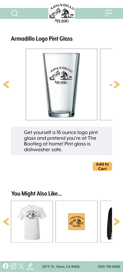
While the project specifications set by my professor only required 12 pages per version, I fell in love with the design aspects of the project and went all out. From designing the layout of the pages to wiring the interactions, I learned so much about creating a website that flows nicely from one page to another. I went so far as to using Photoshop to create the individual images on the merch pages because the images were unavailable on Armadillo's actual website.
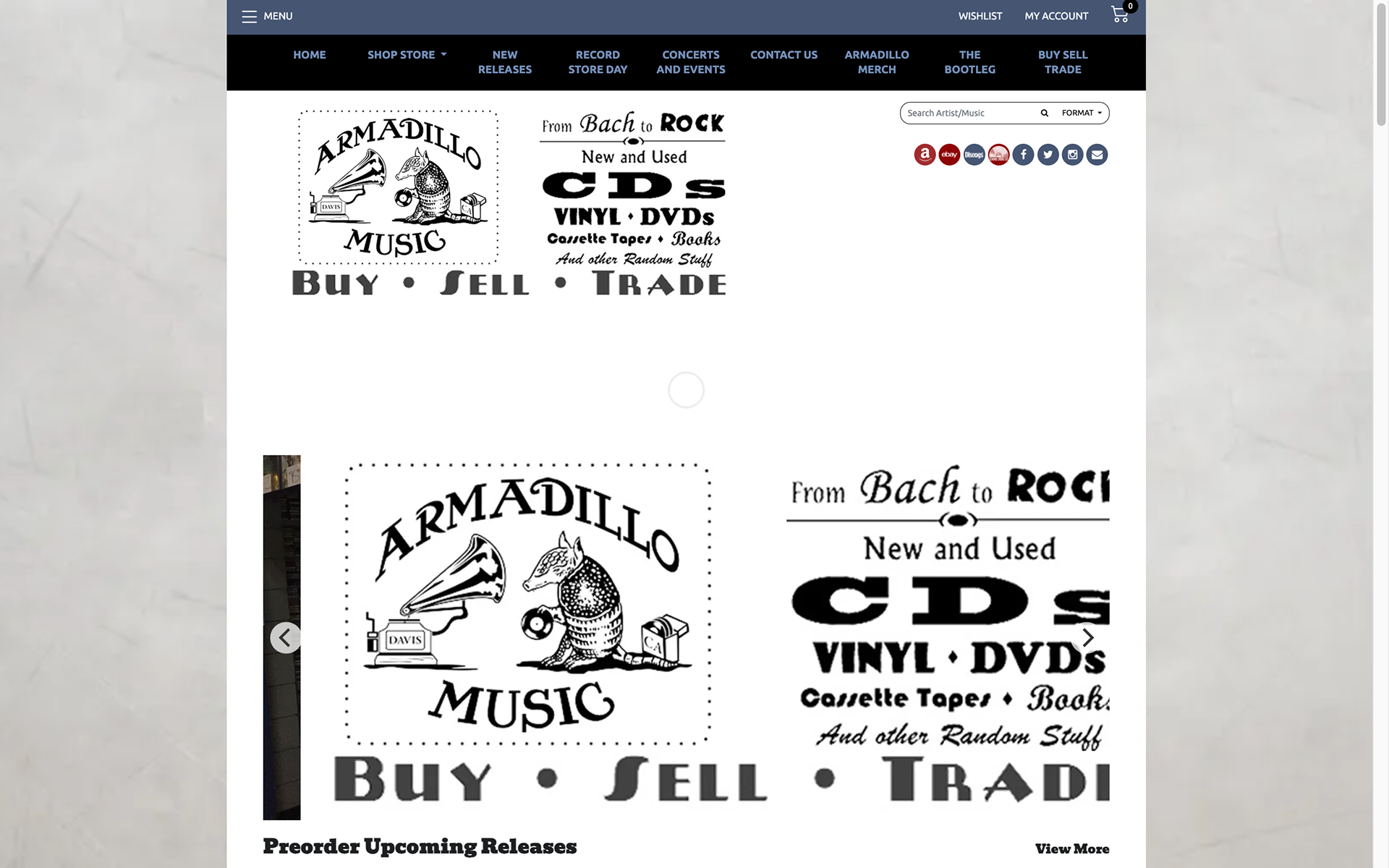
Desktop Version
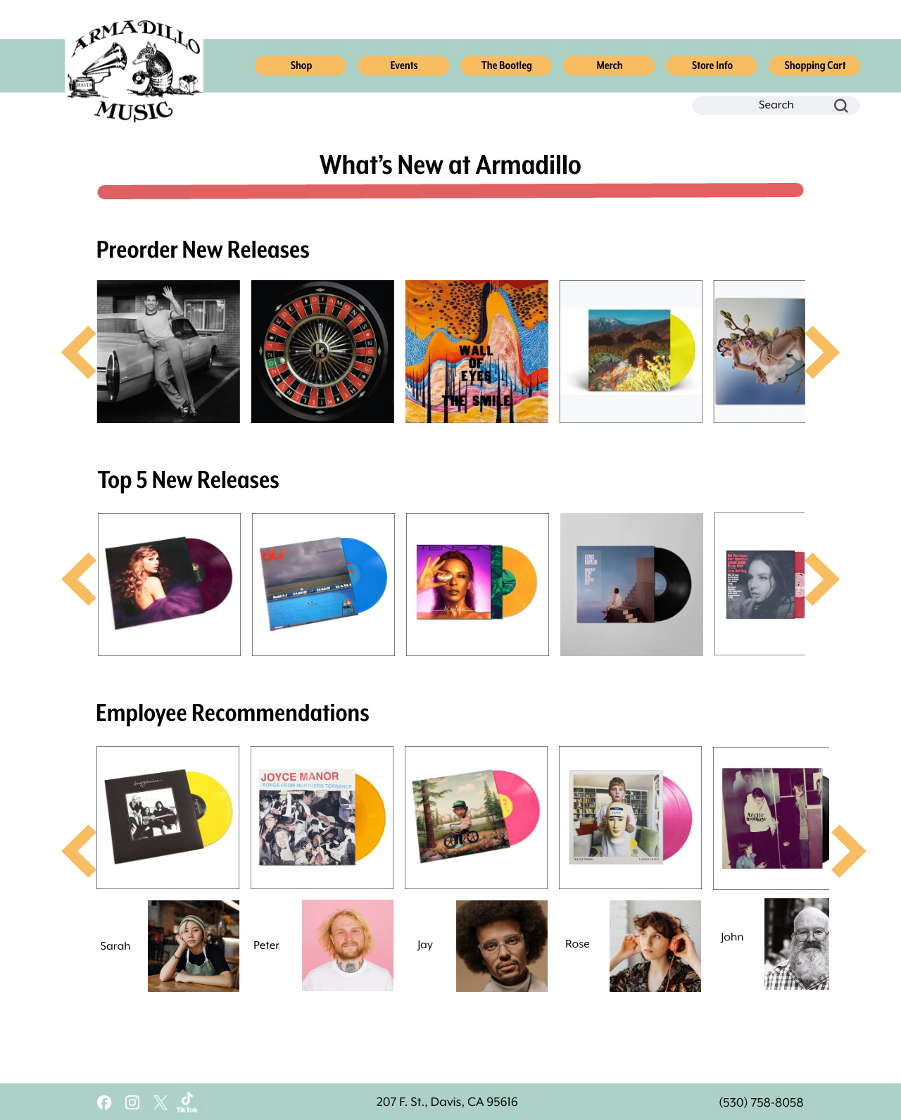
Home Page
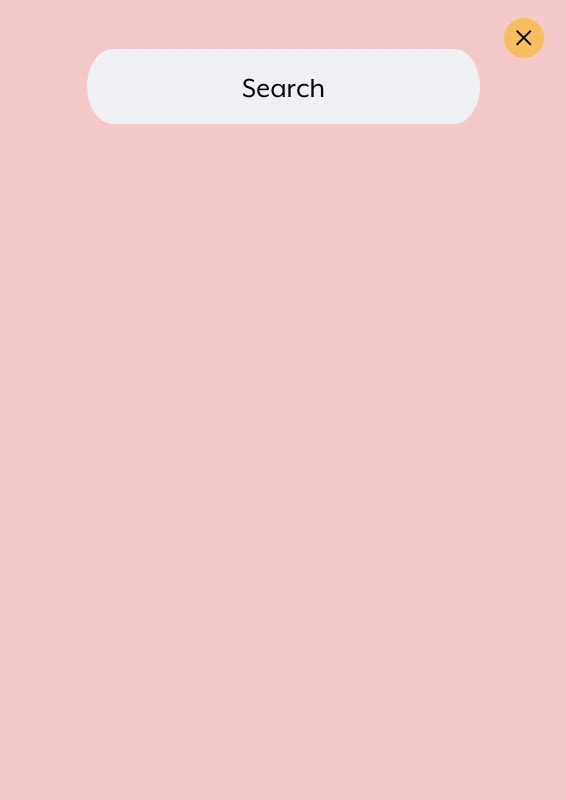
Search Menu
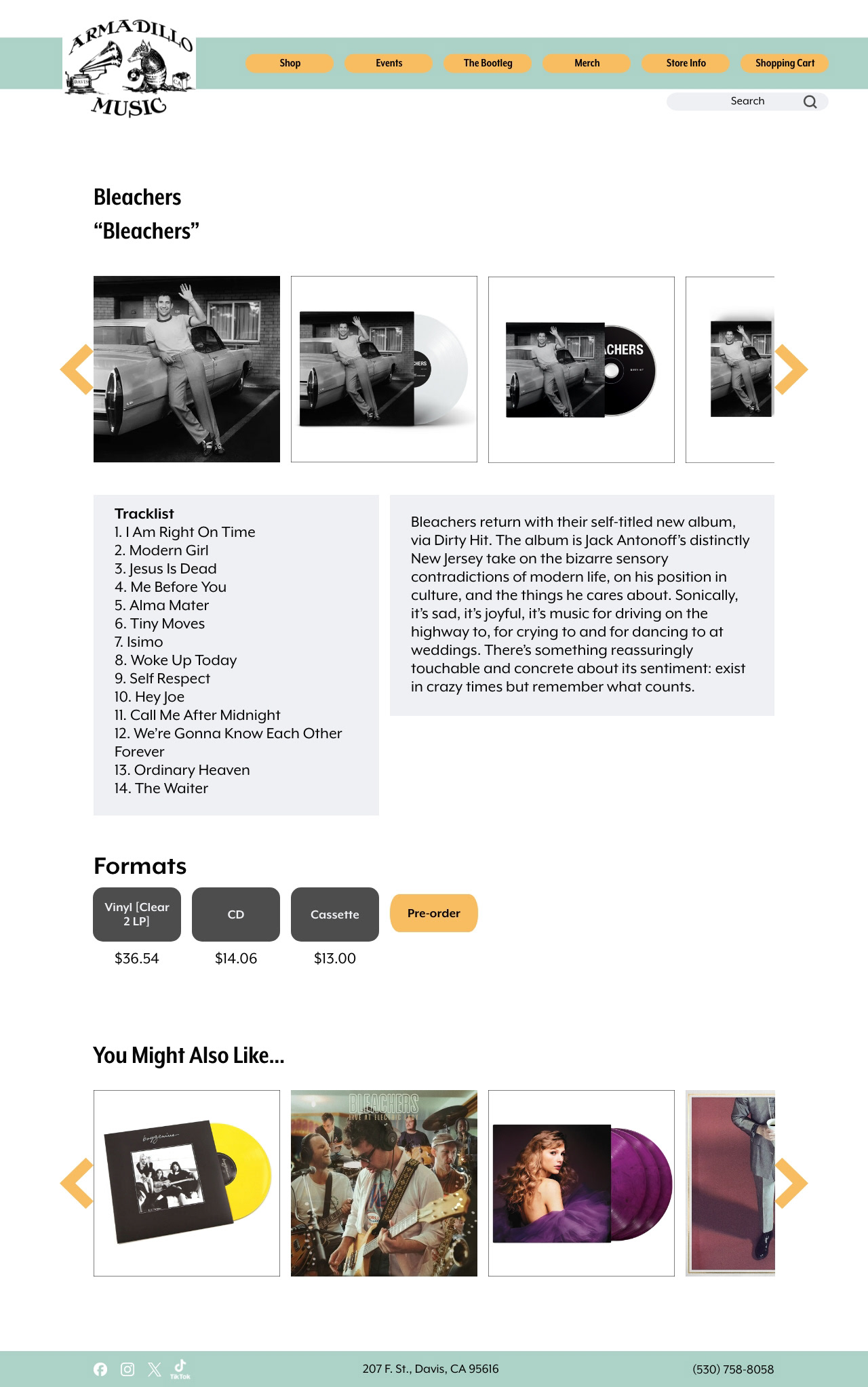
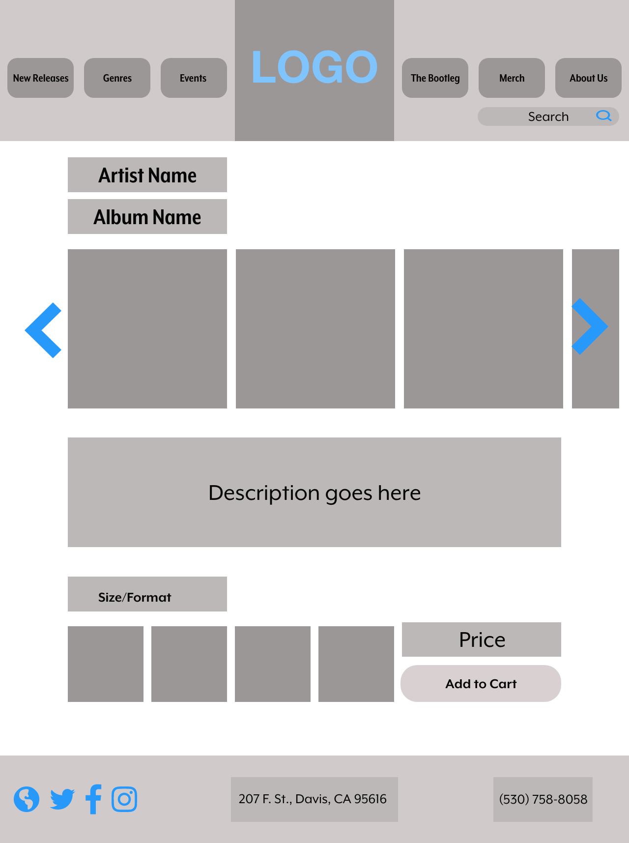
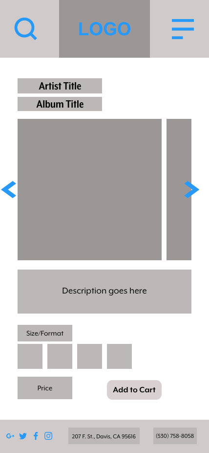
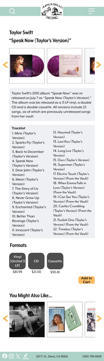
Product Page 1
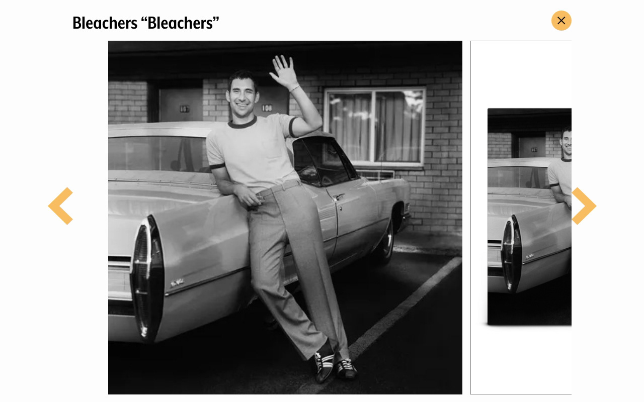
Image Gallery from Product Page 1
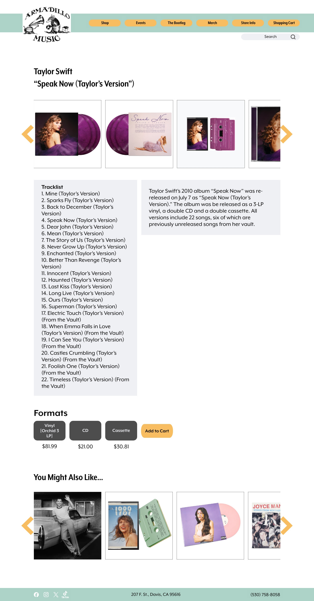
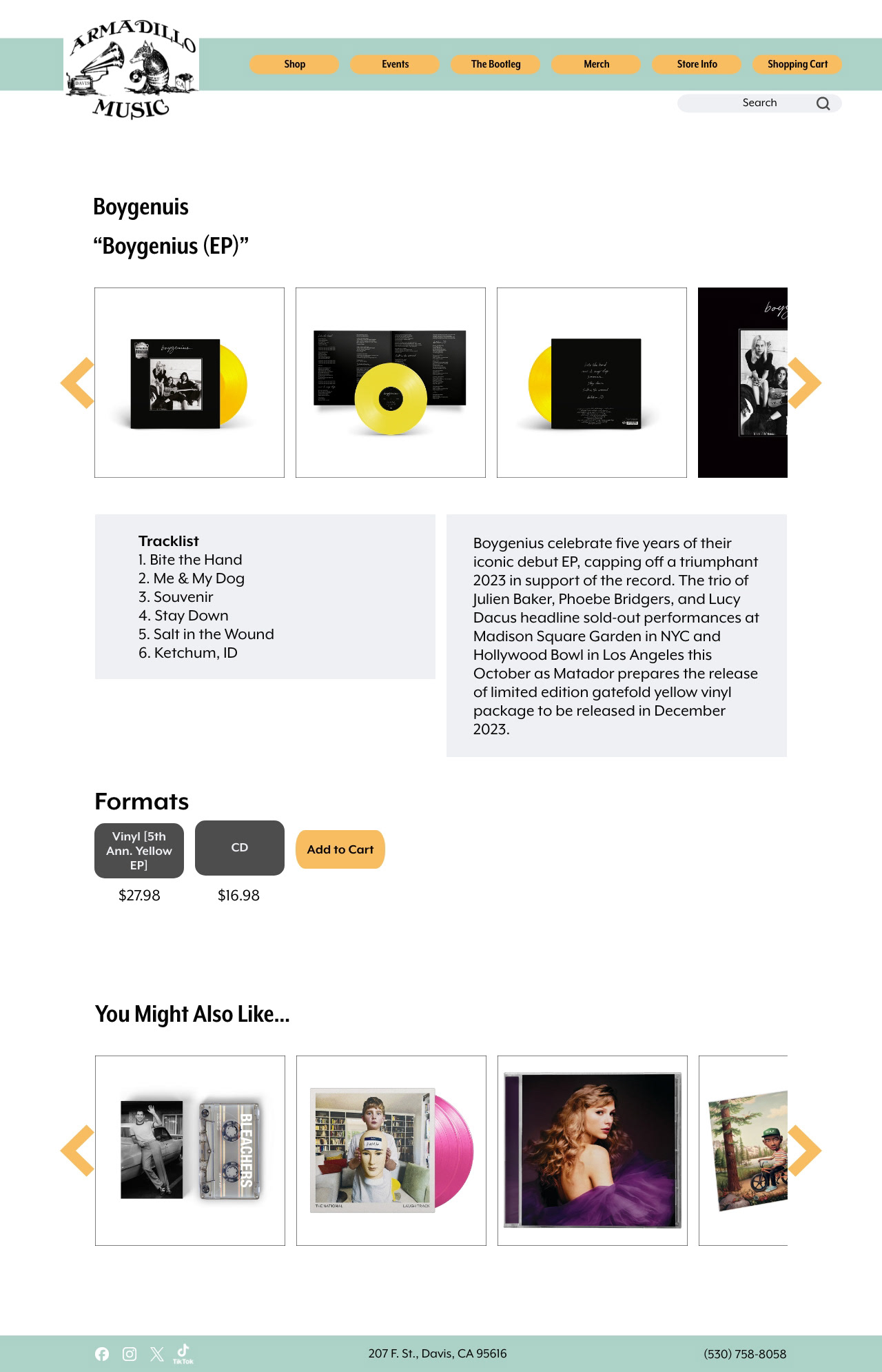
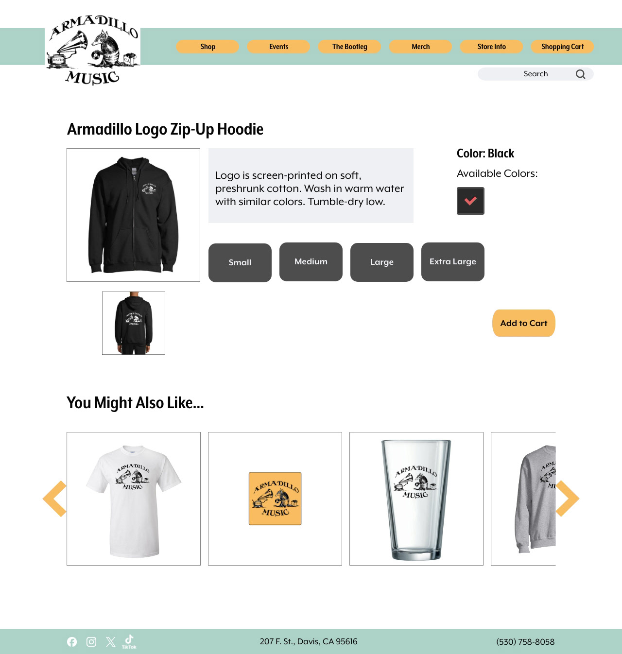
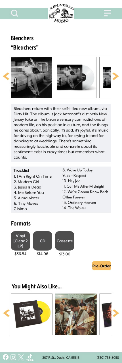
Product Page 2
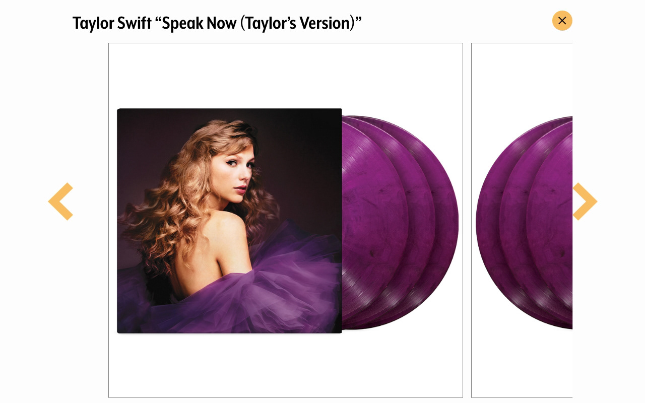
Image Gallery from Product Page 2
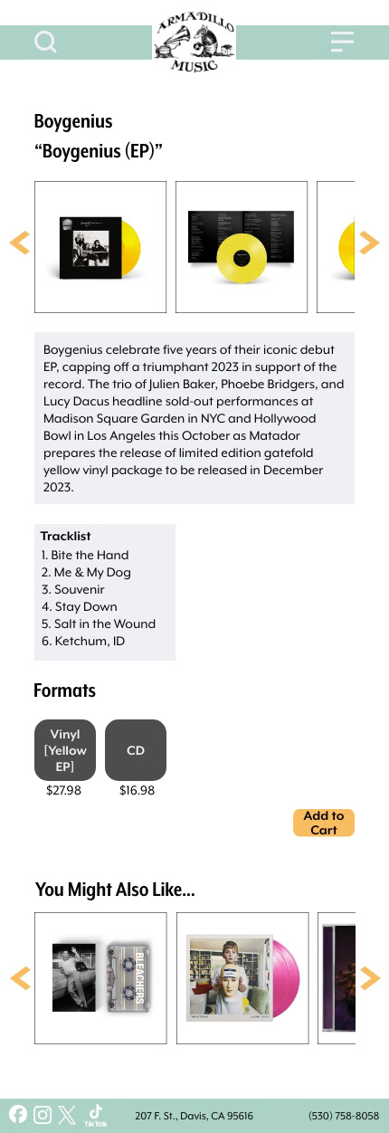
Product Page 3
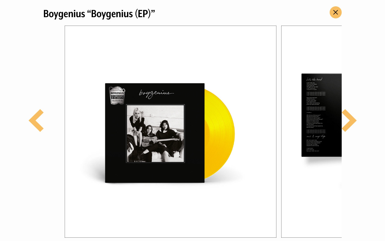
Image Gallery from Product Page 3
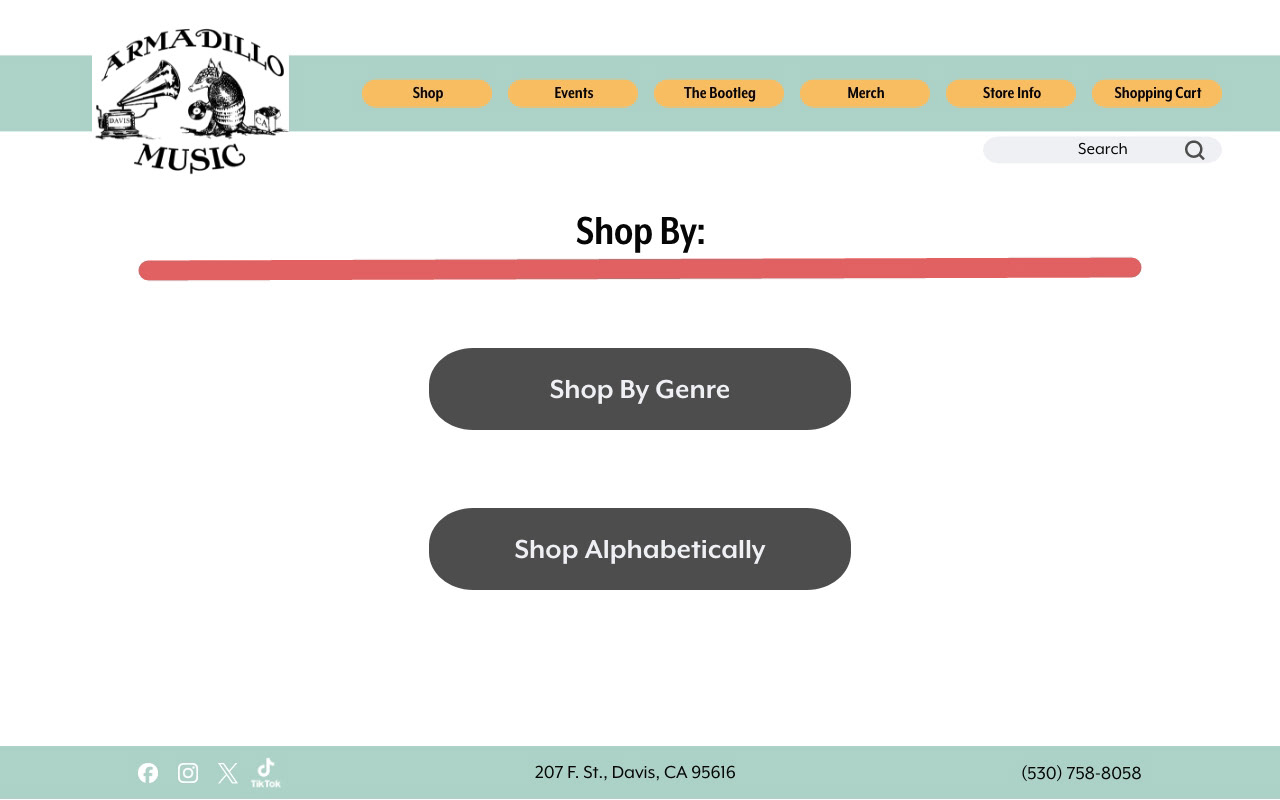
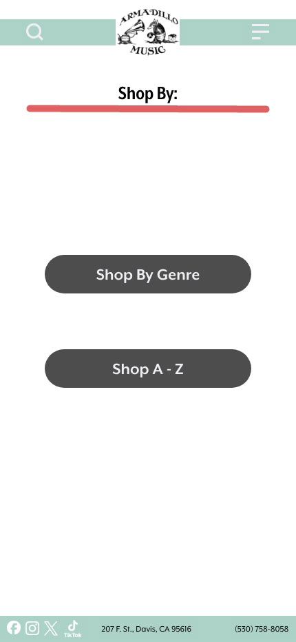
Shop Options
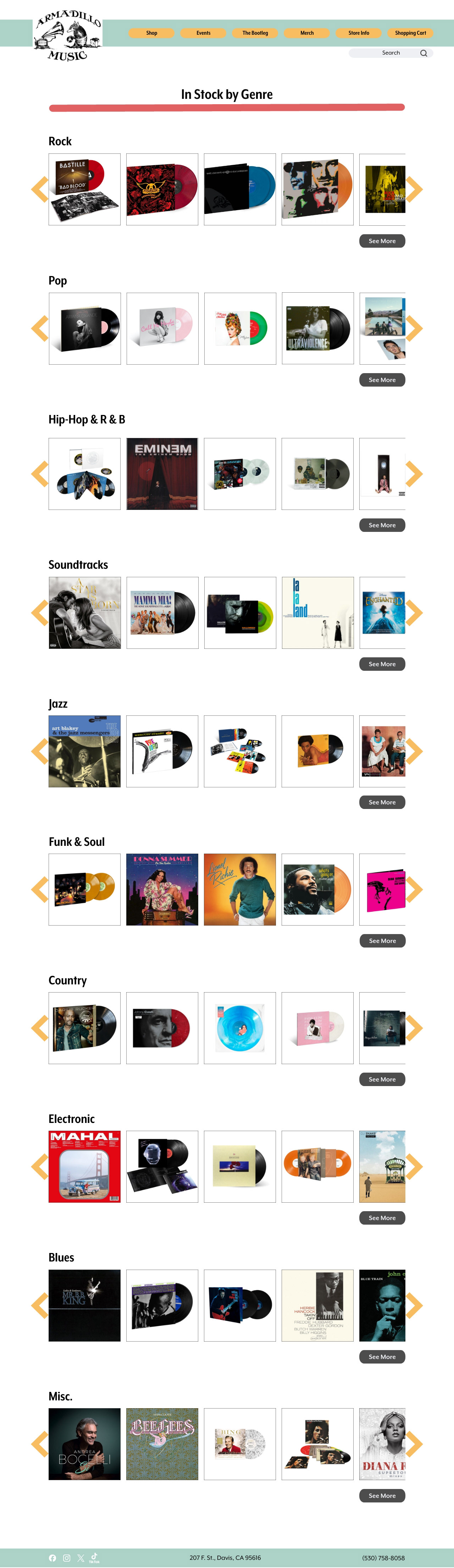
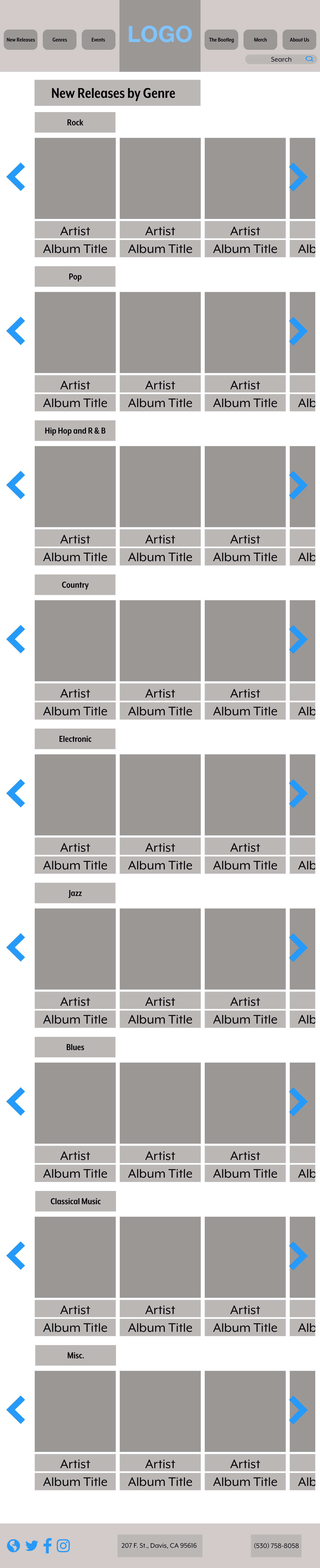
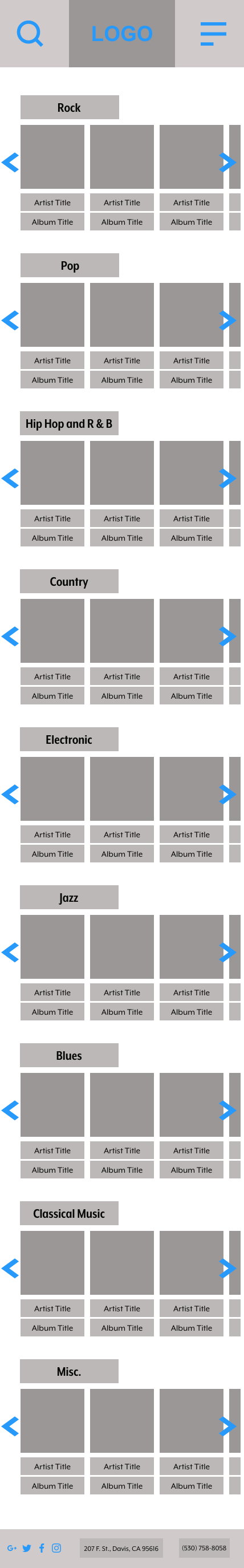
Shop By Genre Page
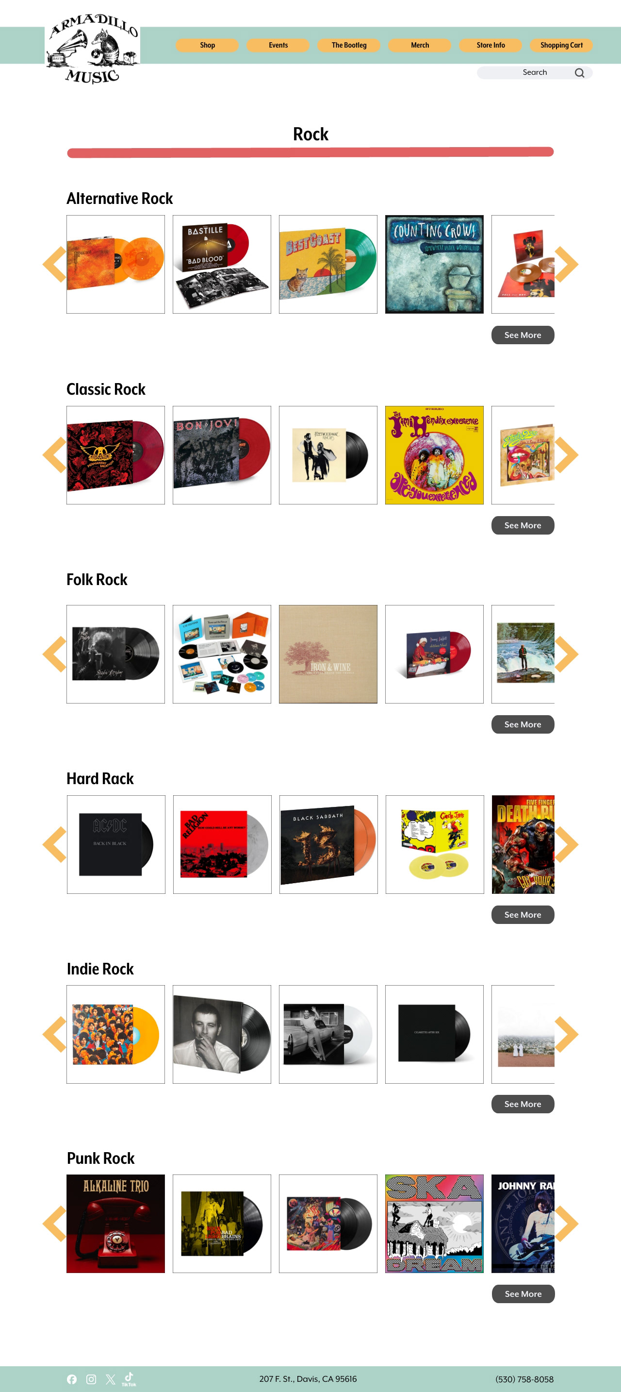
Specific Genre Page Example
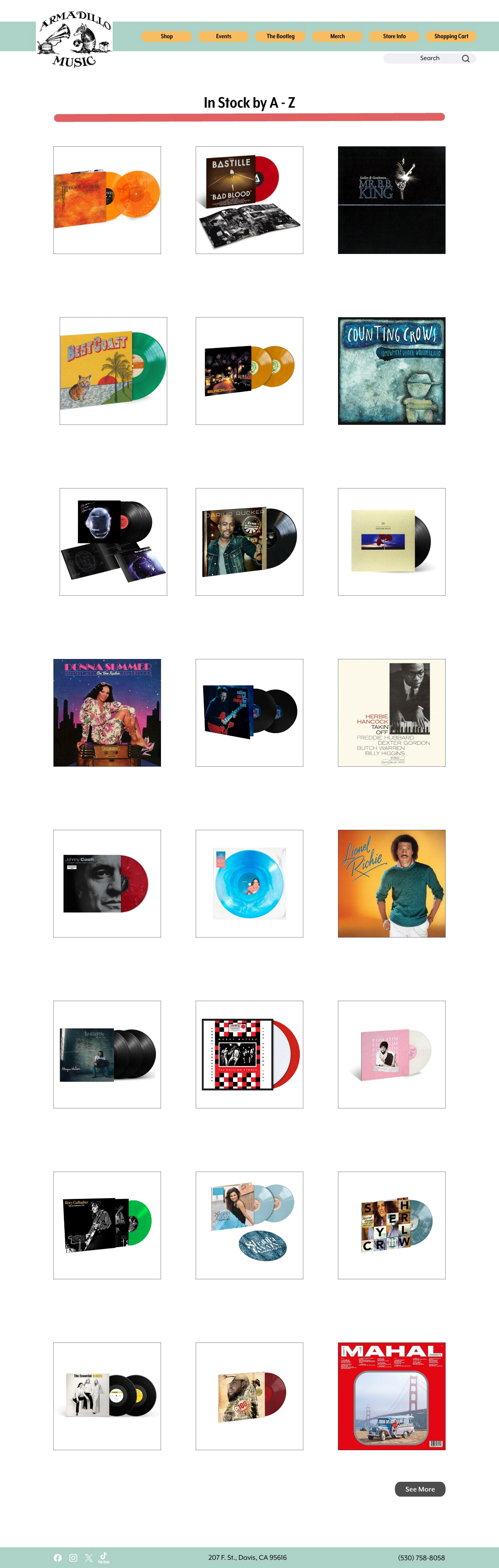
Shop A-Z Page
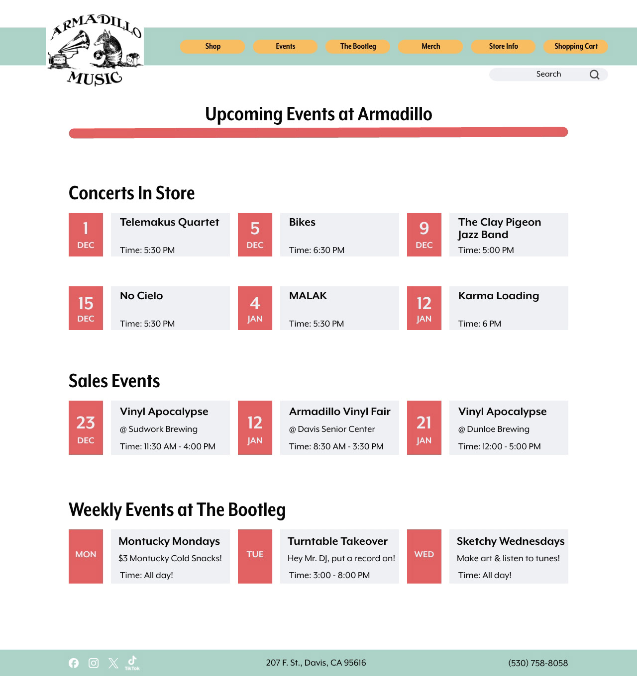
Events Page
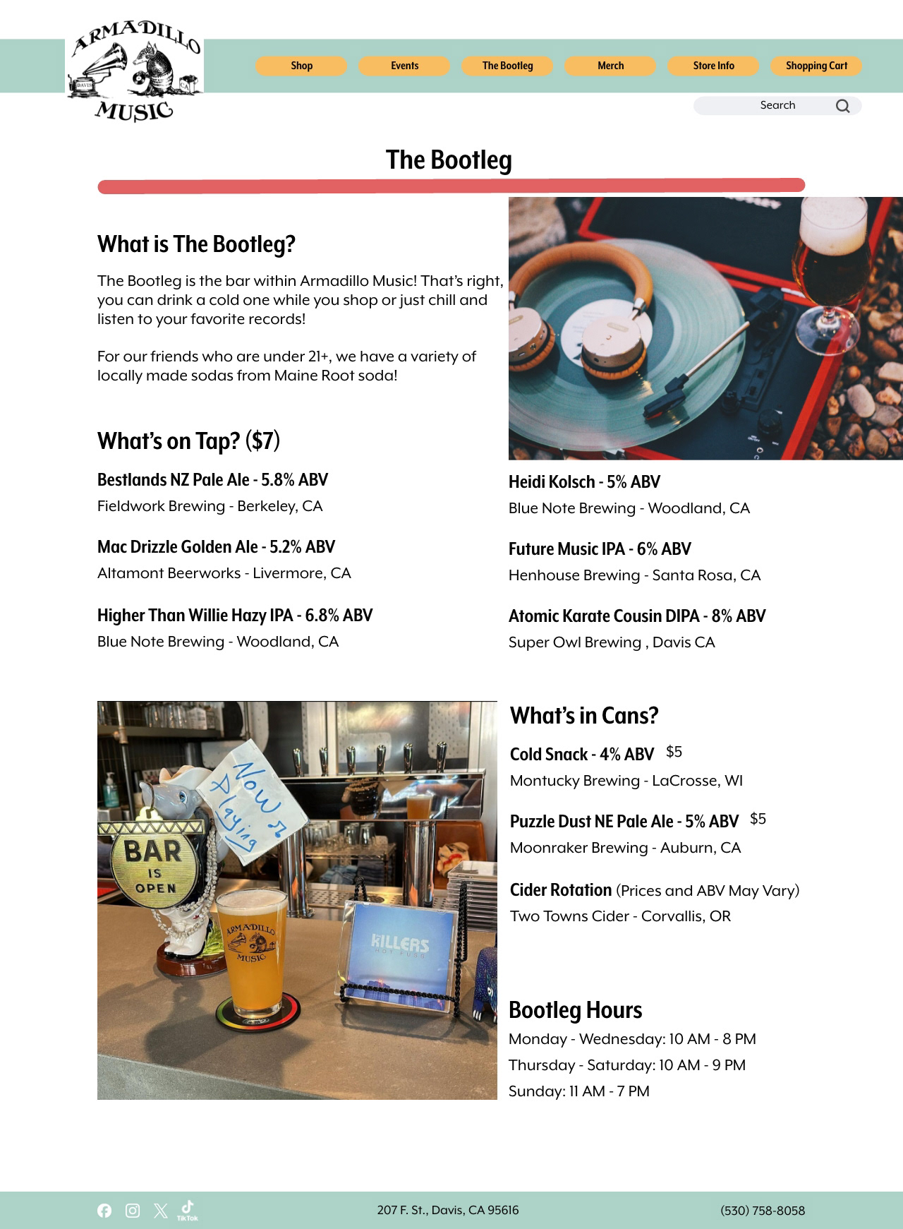
The Bootleg Page
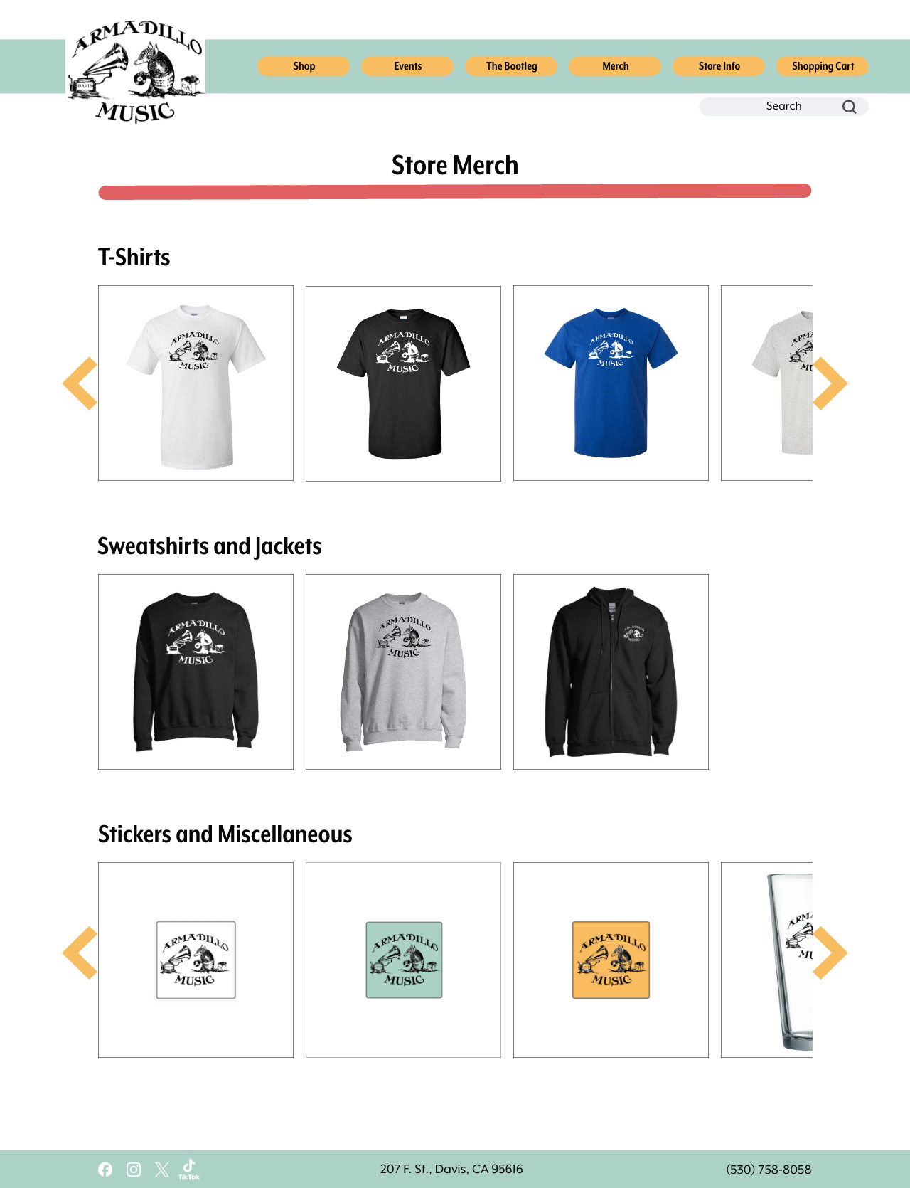
Store Merch Page
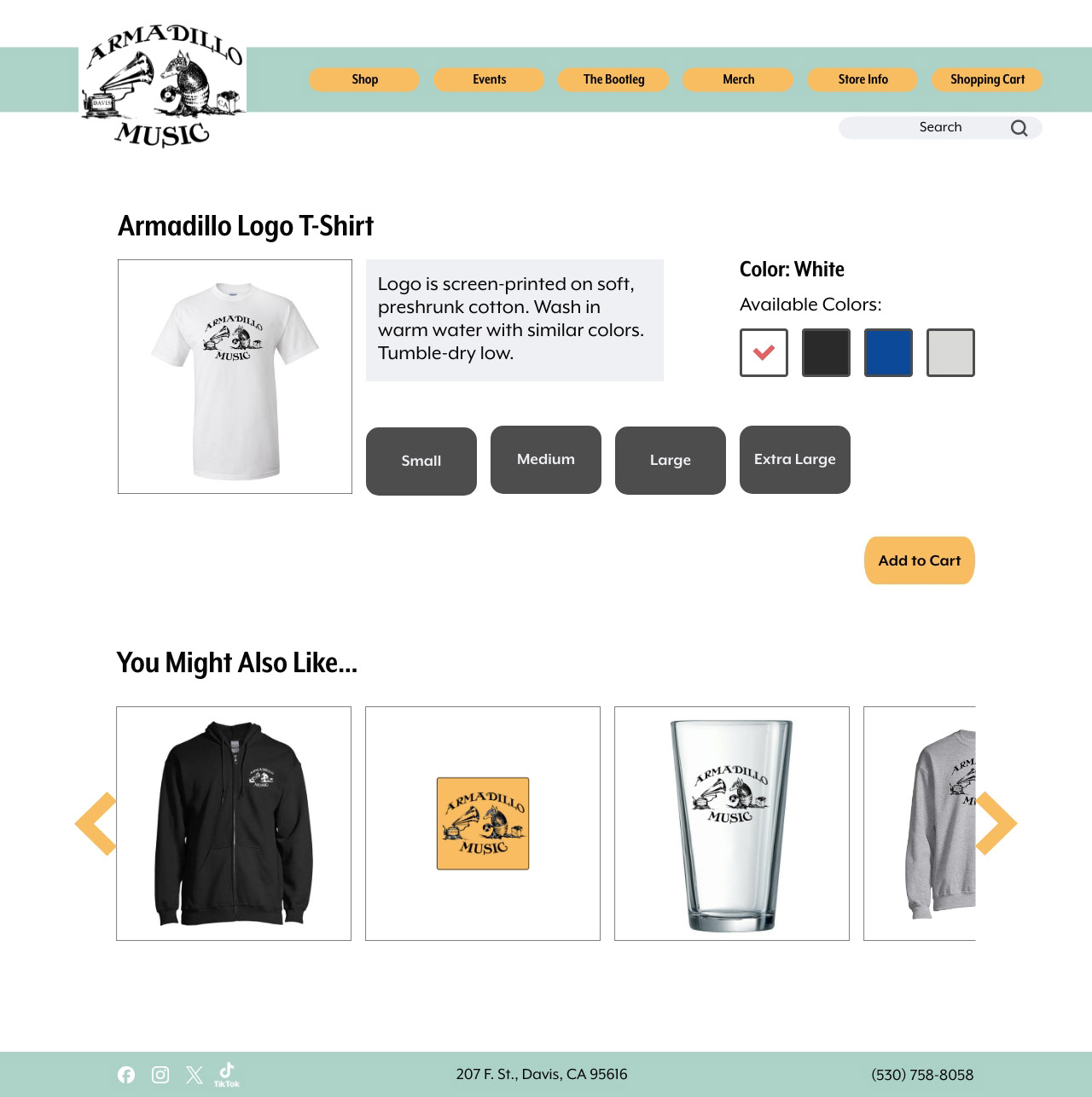
T-Shirt Page Example
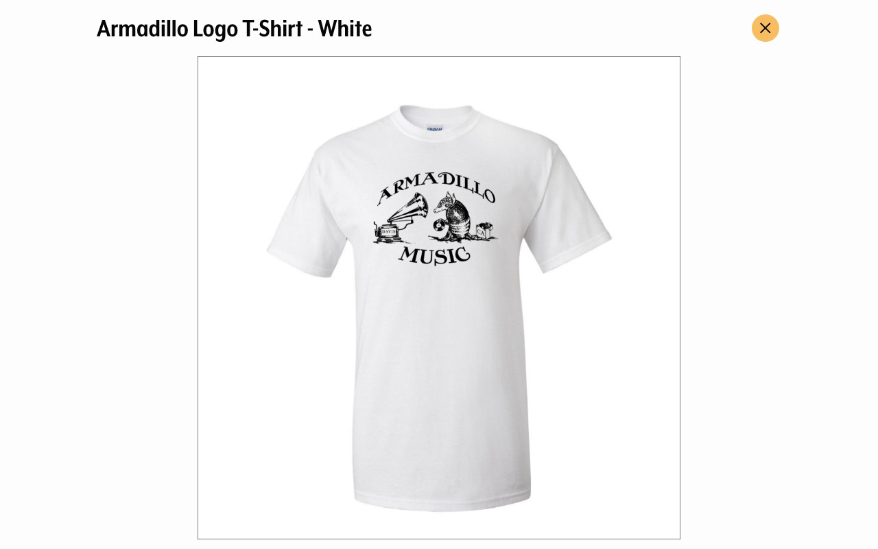
Image Gallery from T-Shirt Page
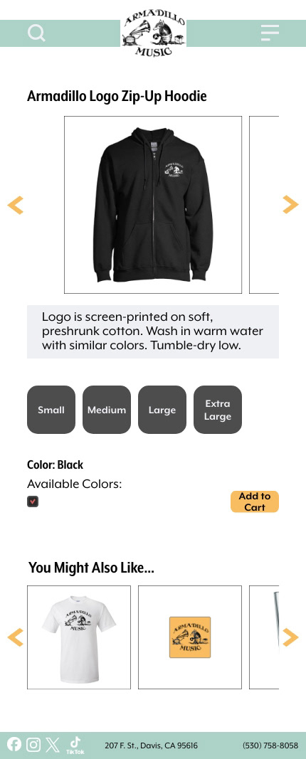
Sweatshirt Page Example

Image Gallery from Sweatshirt Page

Stickers & Miscellaneous Page Example
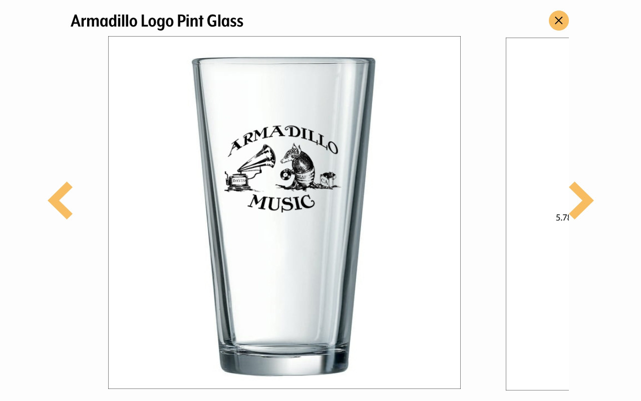
Image Gallery Pint Glass Page
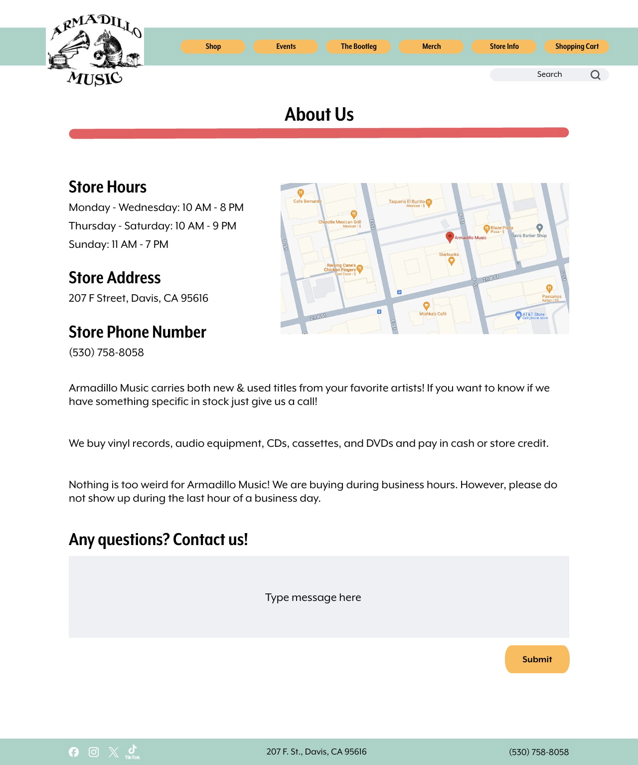
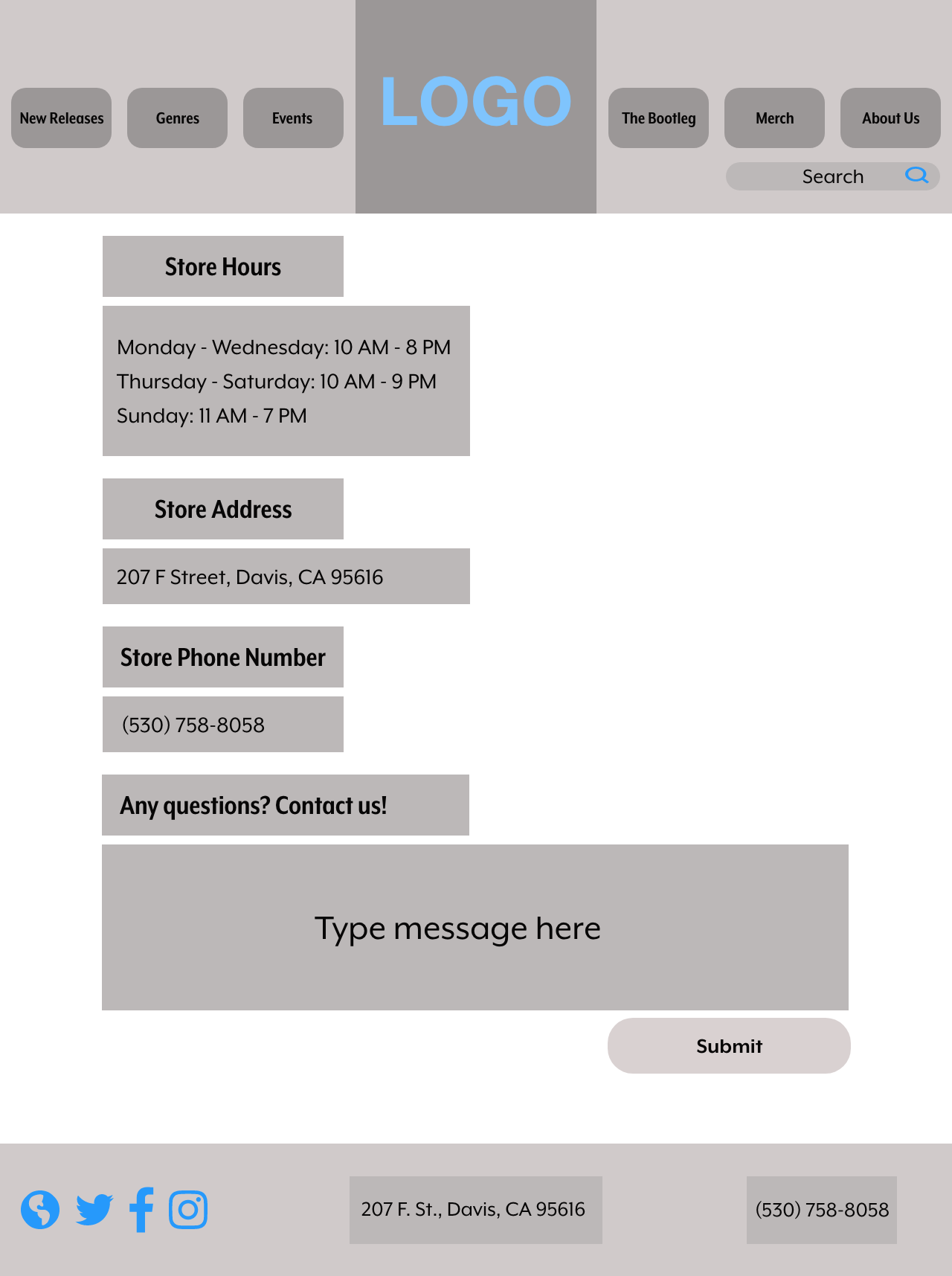
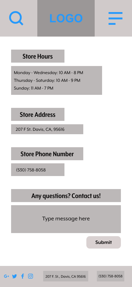
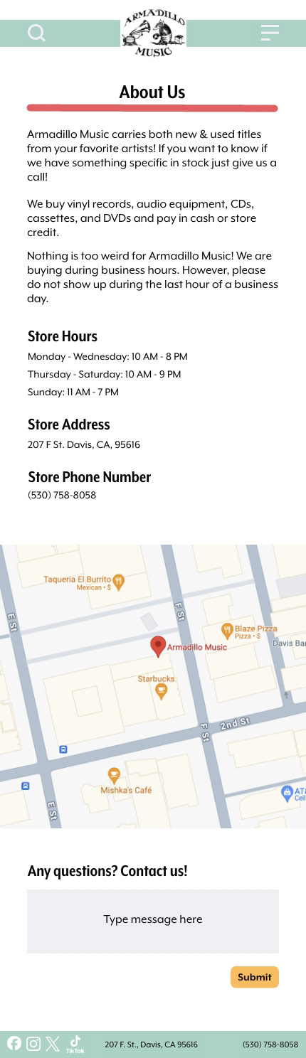
Store Info Page
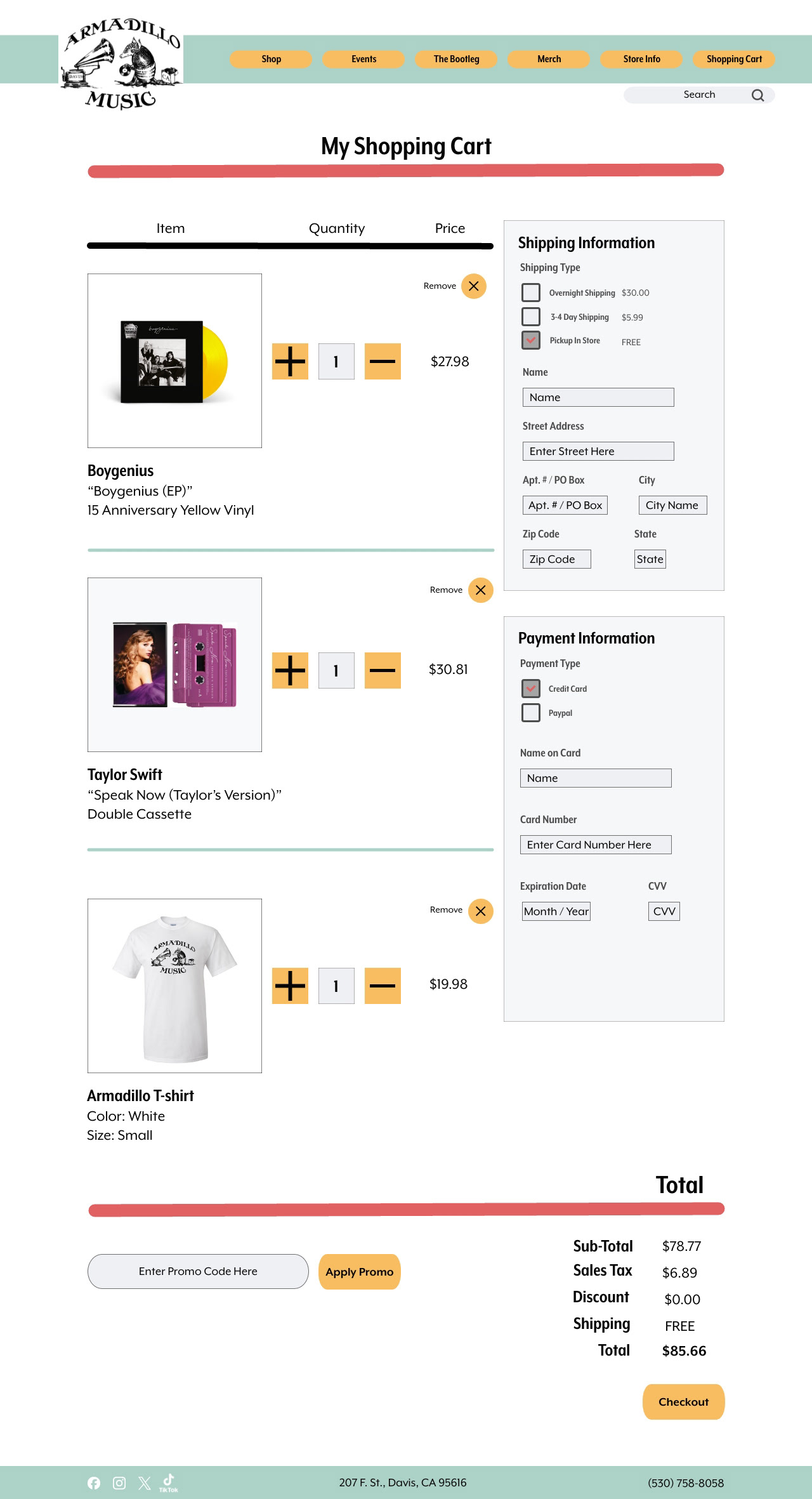
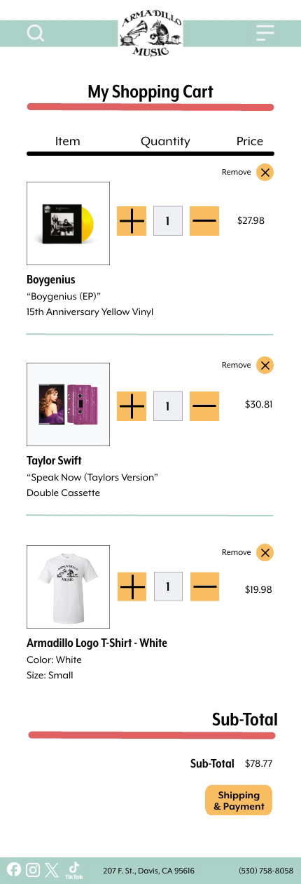
Shopping Cart Page
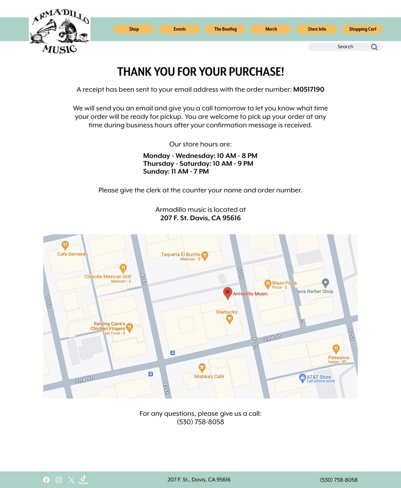
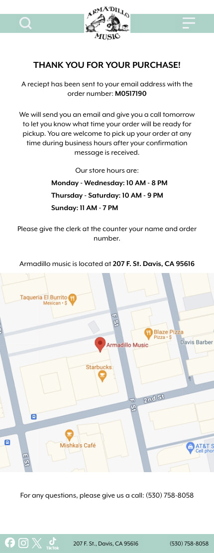
Redirect Page After Purchase
For the mobile version, I wanted to make sure features like The menu and Shipping Options would be better accessible for users. Instead of having a header navigation like the desktop version, I thought that having a slide-in menu would be more user-friendly on a phone. The same though-process went into my design for the Shopping Cart pages. On the desktop version, I included the shipping information and what products were in the shopping cart on the same page for convenience. But for the mobile version, putting all of that information on one page would be visually difficult to read and hard to type into, so redirecting one page to another improved that visual accessibility issue.
Mobile Version
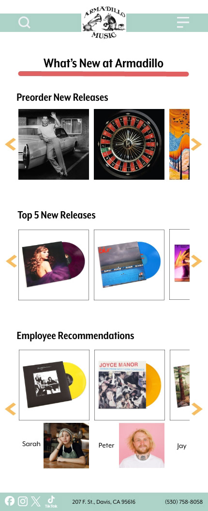
Home Page
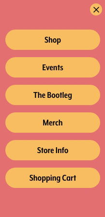
Slide-In Menu
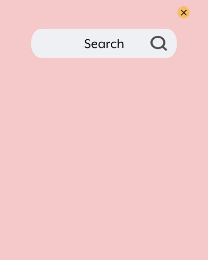
Search Bar
Preorder New Releases Page Example
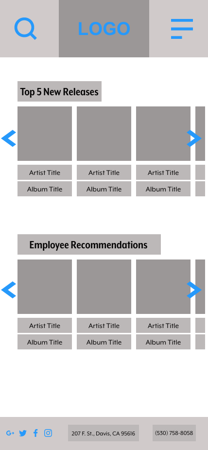
Mobile Top 5 New Releases Product Example
Employee Recommendations Product Page Example
Shop Options Page
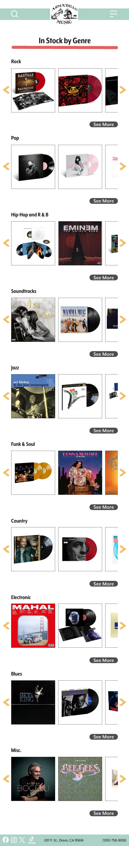
In Stock by Genre Page
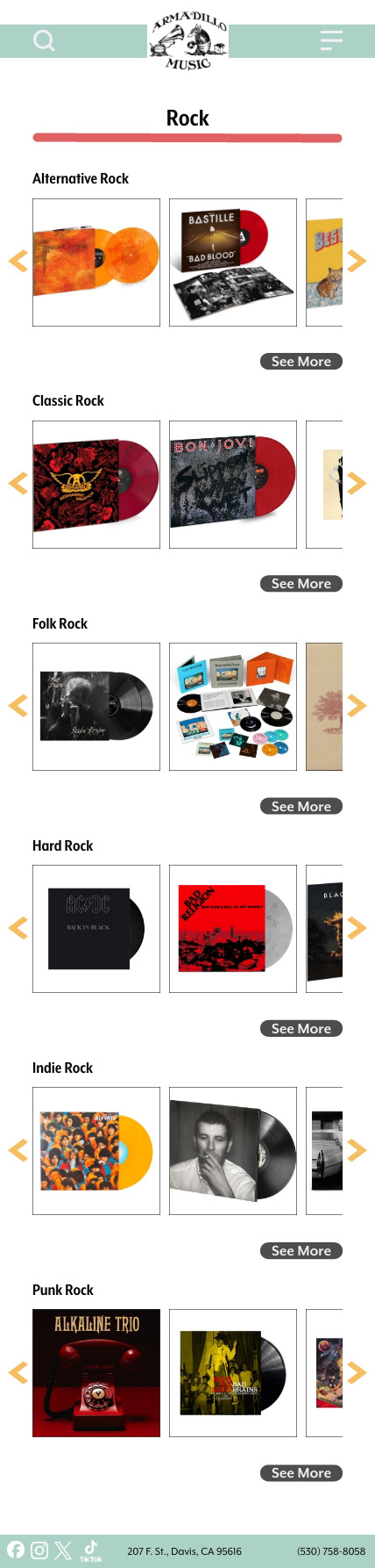
Specific Genre Page
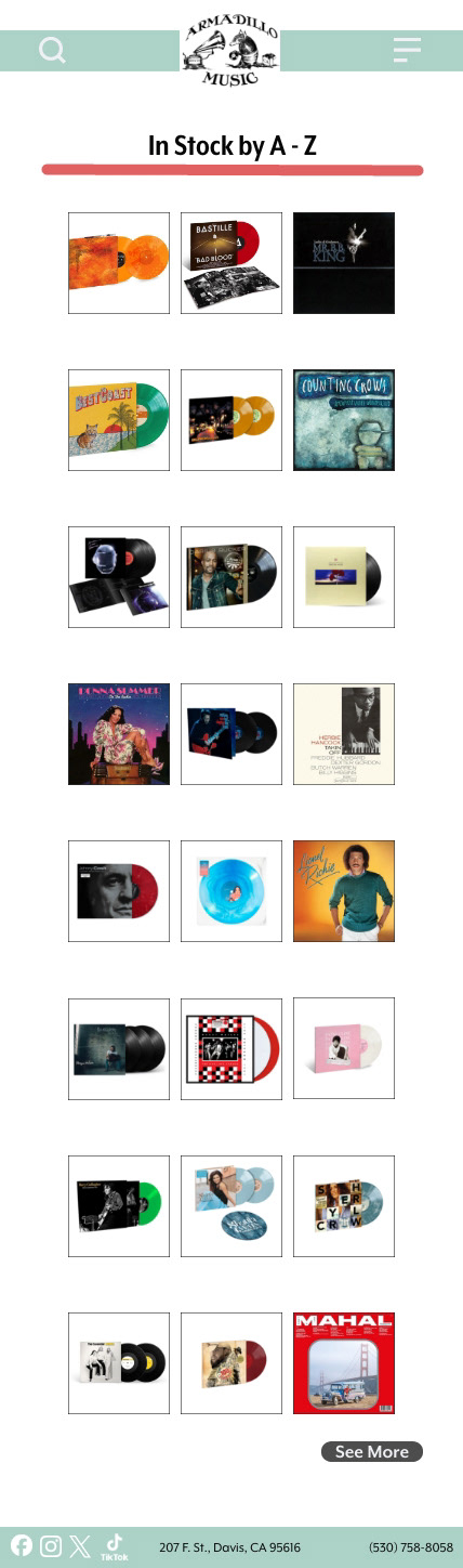
In Stock By A-Z Page
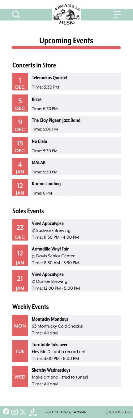
Events Page
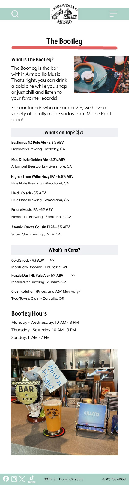
Bootleg Page
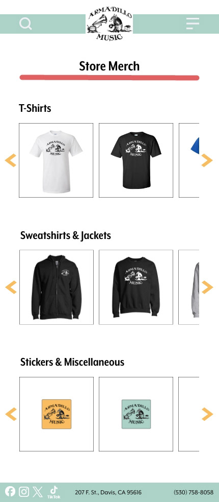
Merch Page
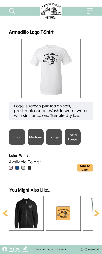
T-Shirt Page Example
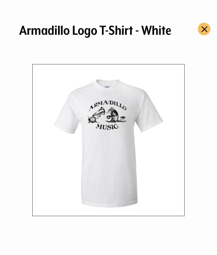
Image Gallery for T-Shirt Page
Sweatshirts & Jackets Page Example
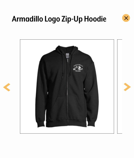
Image Gallery for Sweatshirts & Jackets Page
Stickers & Miscellaneous Page Example
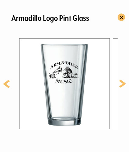
Image Gallery Example
About Us Page
Shopping Cart Page
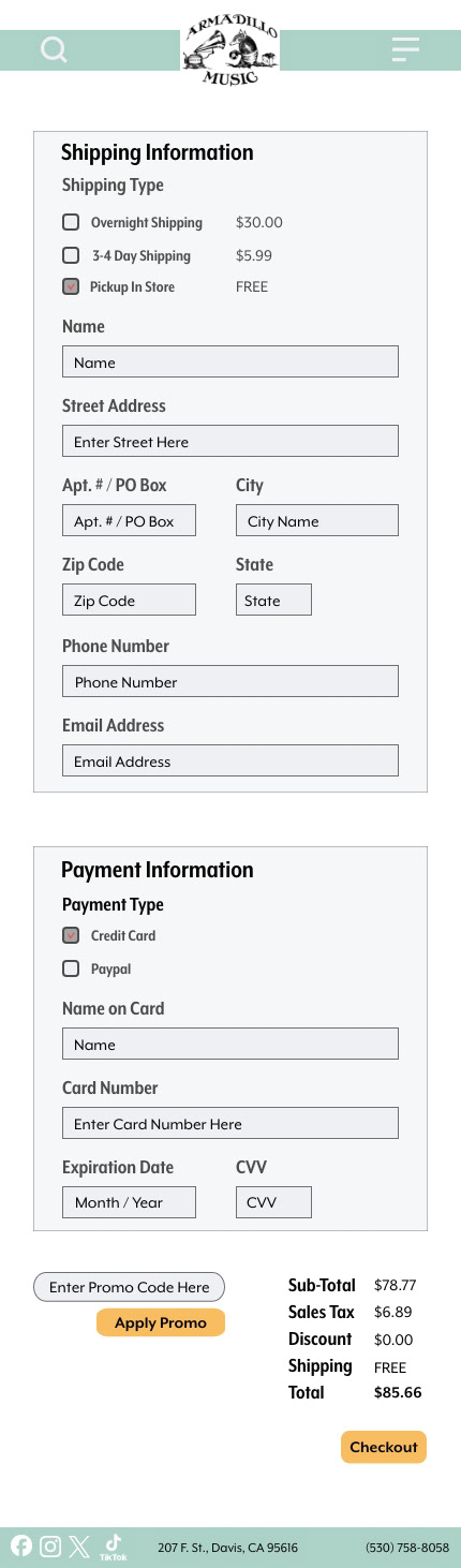
Shipping Information Page